How one product app reshapes daily life for employees, marrying design with functionality

-
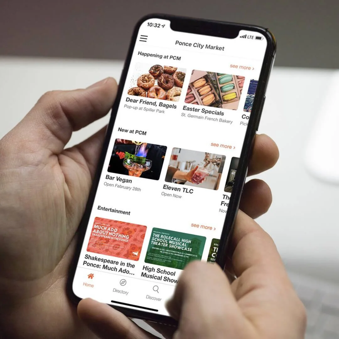
In developing HqO’s app, my background in brand identity was key. Utilizing strategic color and typography, I aimed to ensure the app not only facilitated essential functions like building access and lunch ordering, but also enhanced daily work life through exceptional design and usability.
-
The challenge involved collaborative efforts with product teams and engineers. It was essential to design adaptable views and templates that catered to a diverse range of clients, from corporate entities to landlords, and accommodated various building types.
-
The solution lay in the marketing and design. By experimenting with color schemes, logo placements, and button shapes, I created a suite of app designs that felt personalized yet cohesive, offering a visually appealing and intuitive user experience.
-
The end result was a greatly enhanced user experience with HqO. The app has become an indispensable tool in the workplace, streamlining daily interactions and functions with efficiency and style.