

Ten station maps for Connecticut’s new busway
WAYFINDING
CCSU Central Design
COMPANYSCOPEROLEStudent team lead
TIMELINE2014 to 2015
Wayfinding maps for CT DOT
Project overview
The challenge
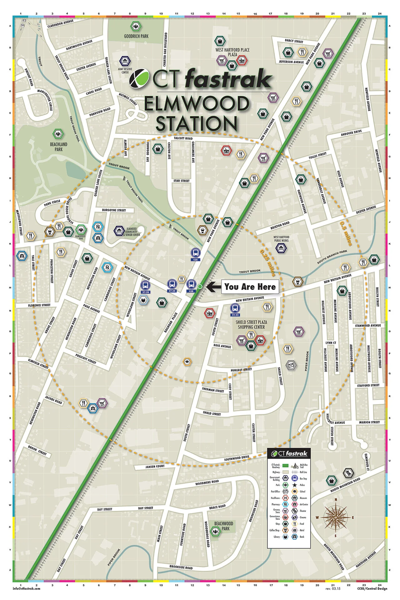
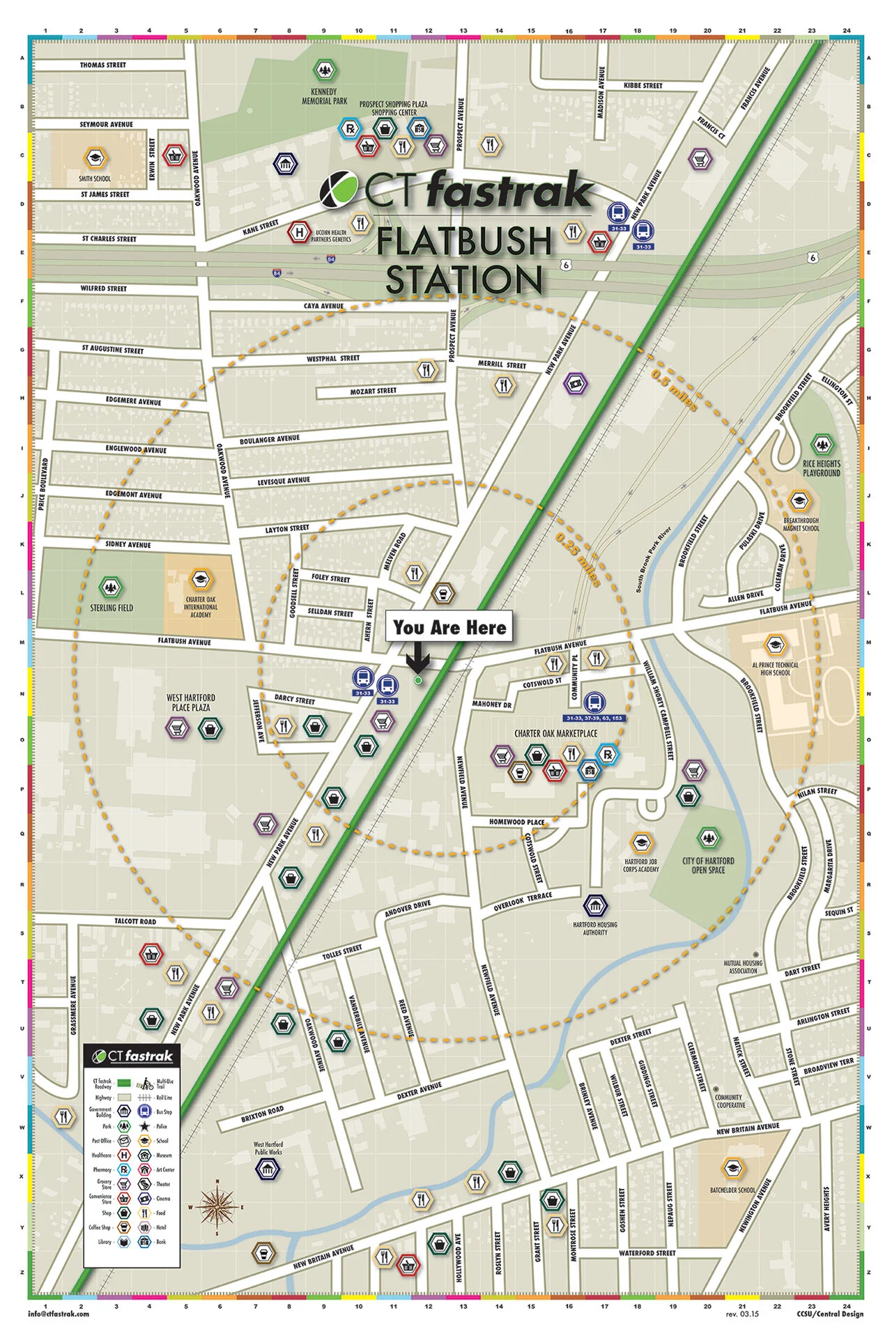
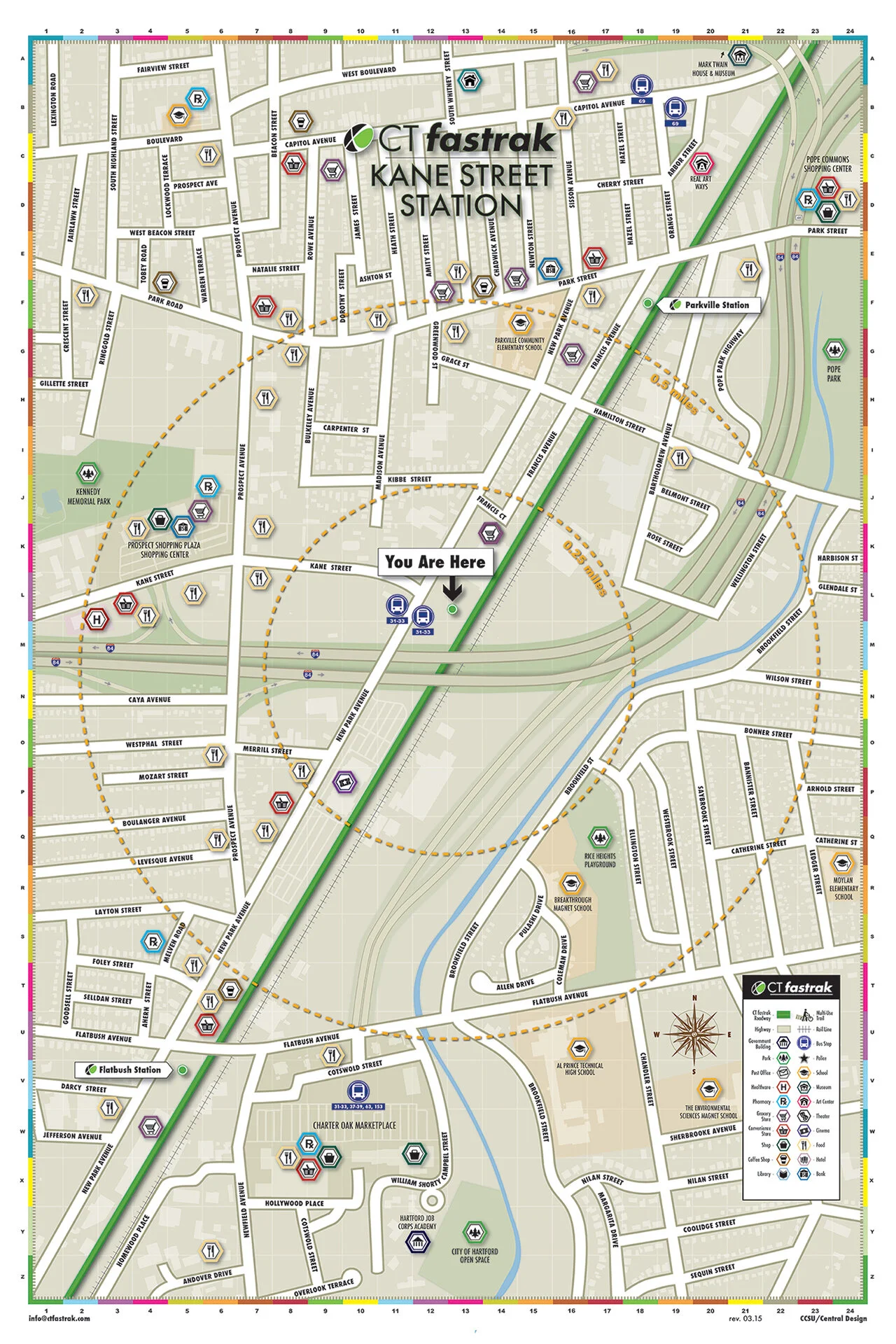
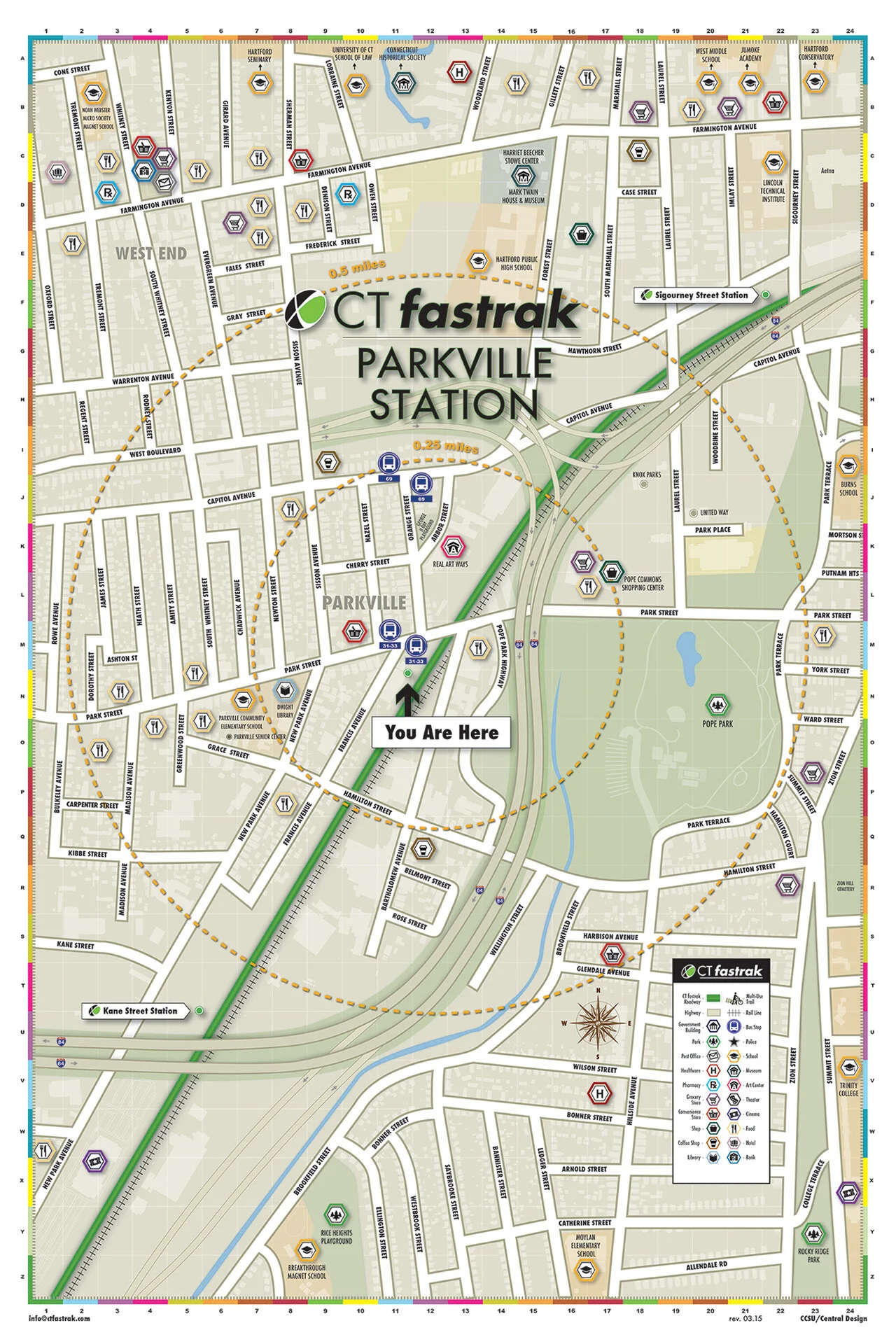
CTfastrak is Connecticut’s first bus rapid transit line, a $347 million busway between New Britain and Hartford. Before it opened in March 2015, the Department of Transportation needed a wall map for each of its ten stations. Every map had to show the stop, the neighborhood around it and the local businesses worth the walk. DOT brought the project to Central Design, the student agency at Central Connecticut State University.
My role
As lead designer at Central Design, I led the student team. Alongside our design department chair, I met with the DOT marketing team, split the map work across the group and saw all ten maps through design and production.
Ten stations, one system
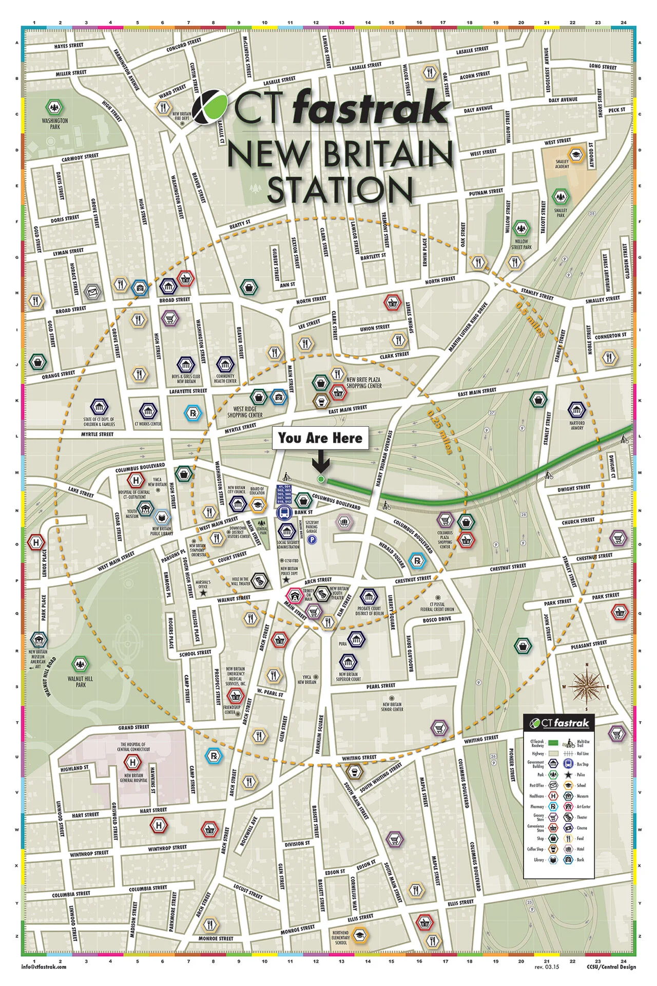
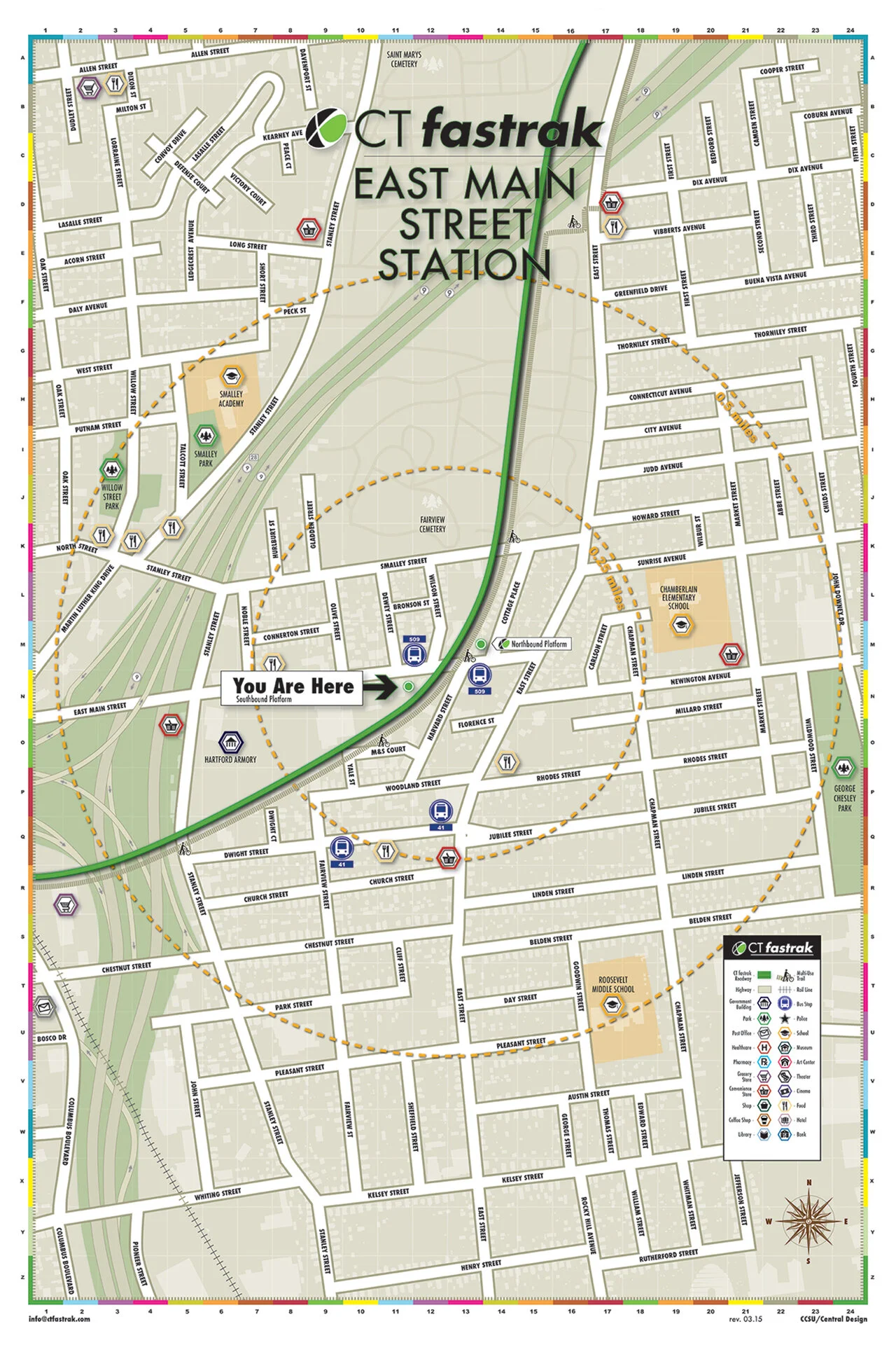
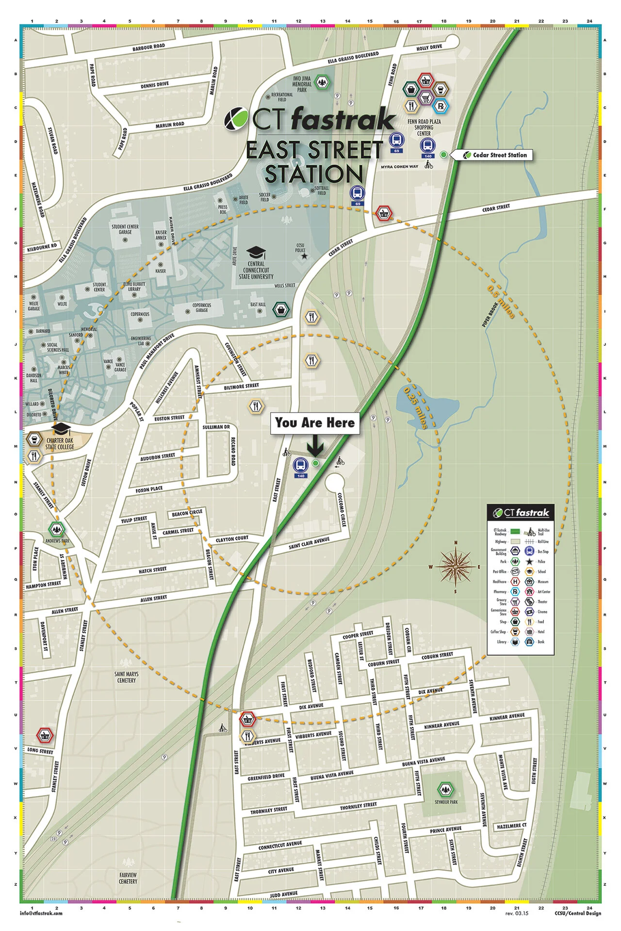
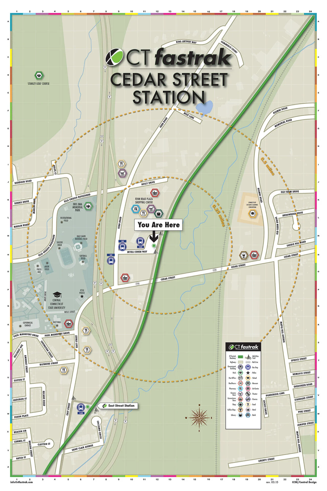
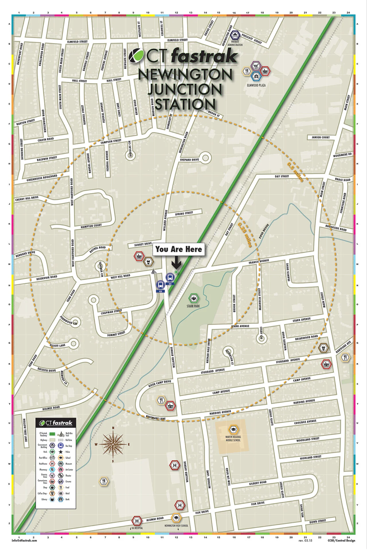
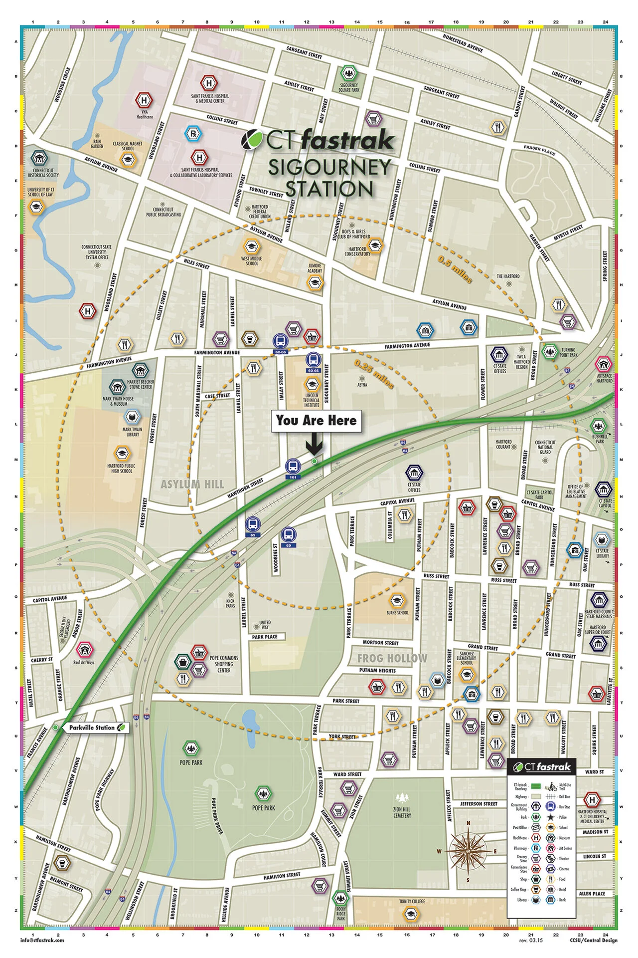
We started with little more than a technical map of each area. Every map puts the station at the center, rings the blocks within walking distance and pins the shops, schools and parks nearby with an icon set and color code built for the series.
MAPS
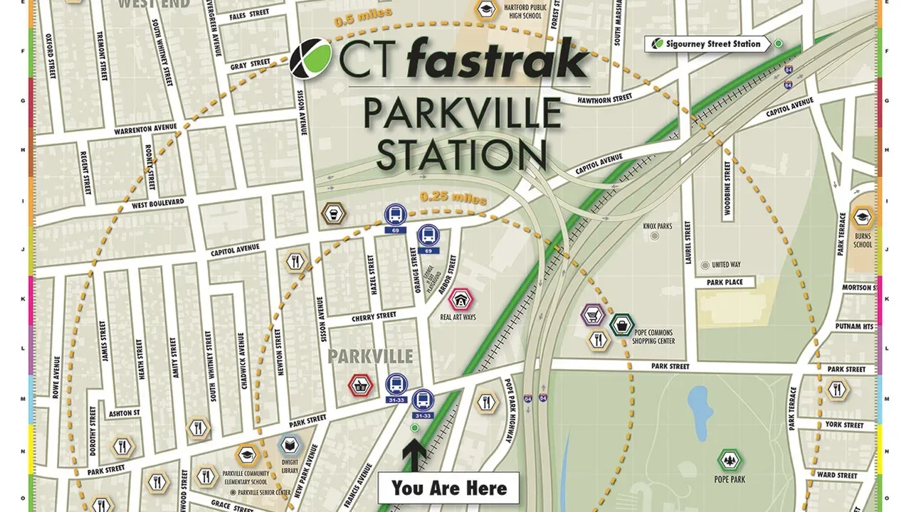
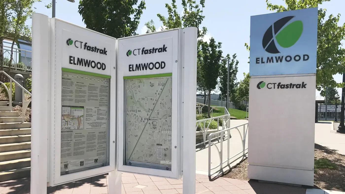
Read in seconds from the platform
The logo, the “You Are Here” marker and the legend sit where riders look first, so someone stepping off the bus can get their bearings and go. Each station displays its map in a case beside the platform.
WAYFINDING
Front page news
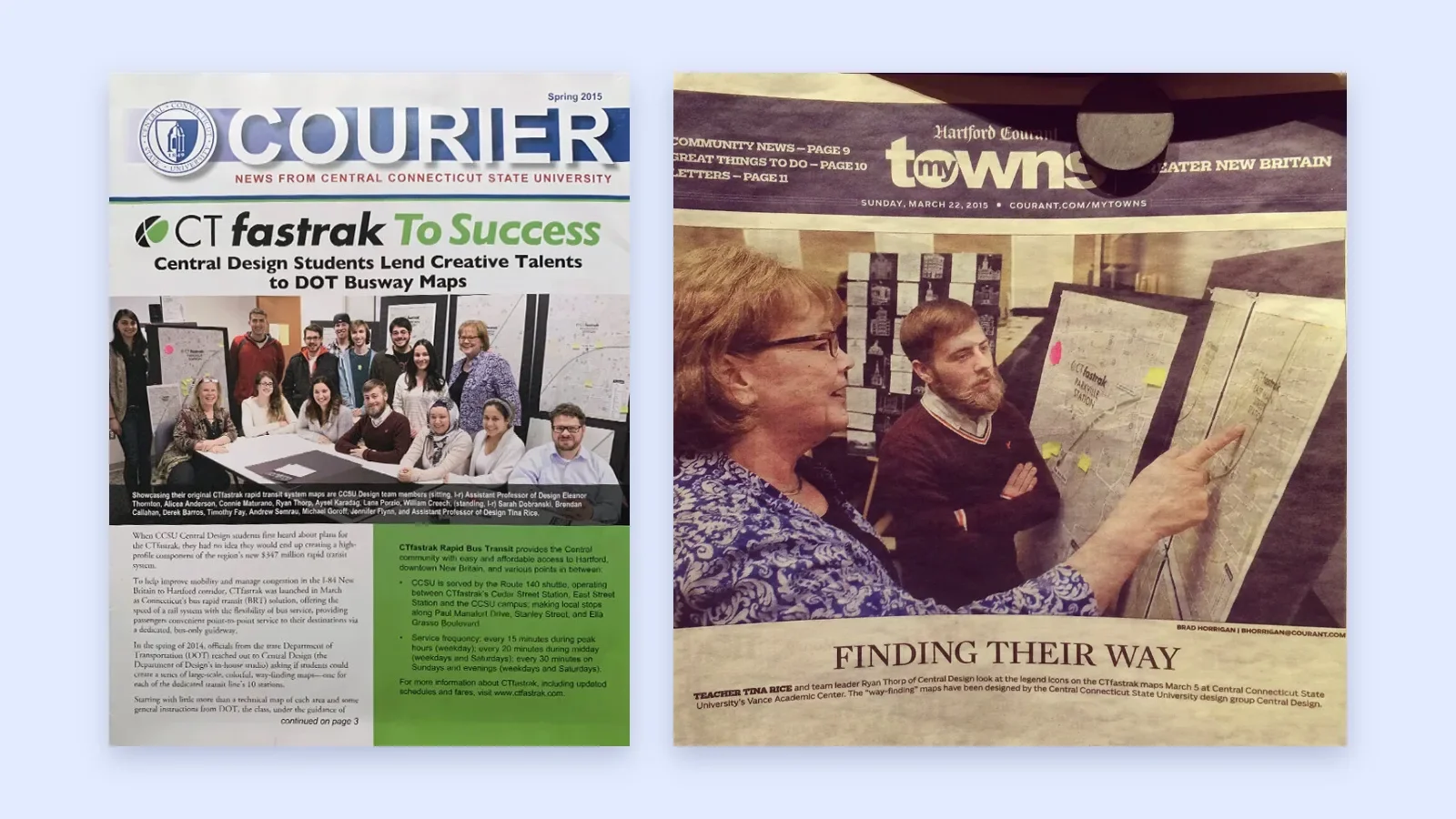
The CCSU Courier put our team on its spring 2015 cover, and the Hartford Courant’s myTowns section ran the story on its front page the week before launch.
PRESS
All ten stations
One series, ten neighborhoods
Each map follows the same grid, icons and color code, so a rider who learns one station can read them all. All ten were up for opening day in March 2015. Open any map to see it full size.
Outcome
Feedback
“I’m extremely happy with these maps. There are a lot of hours involved, and the aesthetic flair the students provided is not something we at the DOT would have been able to accomplish. The overall project, I thought, worked out great.” (James Stutz, CT DOT)
Lessons
Splitting ten maps across a team of students only worked because we agreed on the system first: one grid, one icon set, one color code. I still build the system before the pieces.

Nasuni: giving file storage a brand people remember
NEXT CASE STUDY