
Rebranding HqO for everyone in the building
HqO
COMPANYSCOPEROLESenior Designer
TIMELINE2021 to 2022
Rebrand, product UI, events, content
Project overview
The challenge
HqO makes a workplace experience platform for building owners and the people who work in their offices. The company needed a visual identity strong enough to match its vision across the app, the website, sales and events.
My role
As Senior Designer, I led the HqO rebrand, one of my first projects there: new brand guidelines; static, video and audio content for the website and partner platforms; and webinar content for online distribution.
Workplace Experience app (Wx)
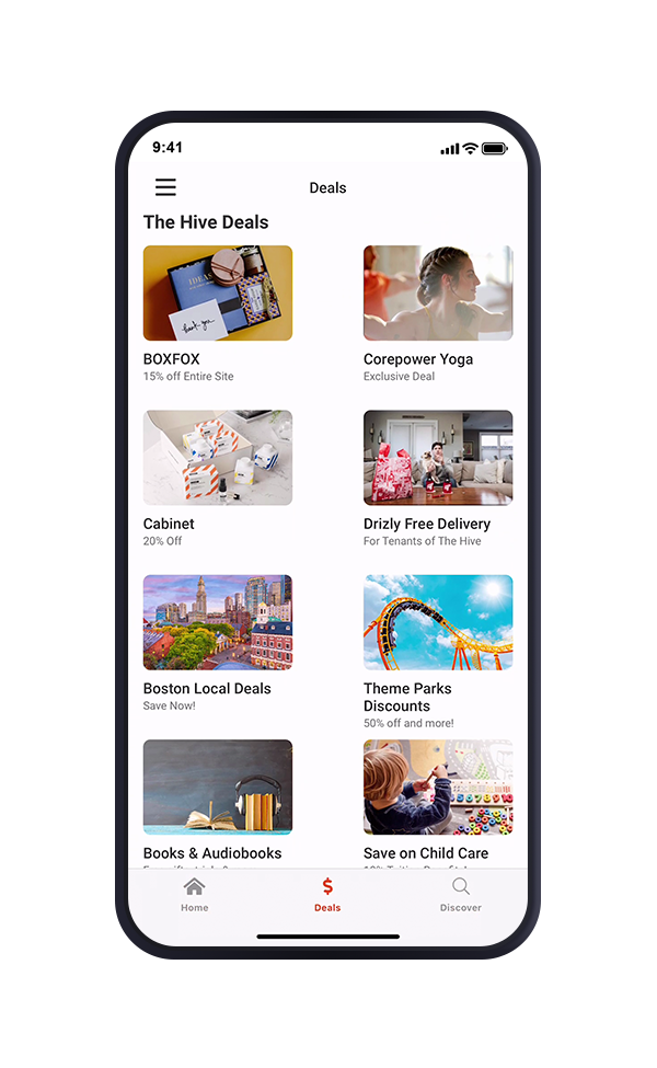
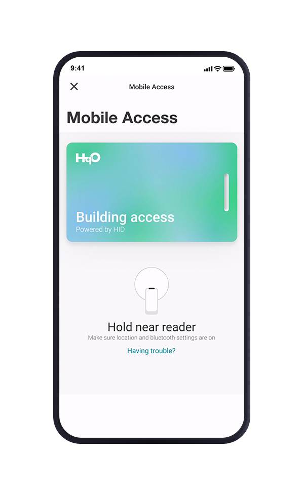
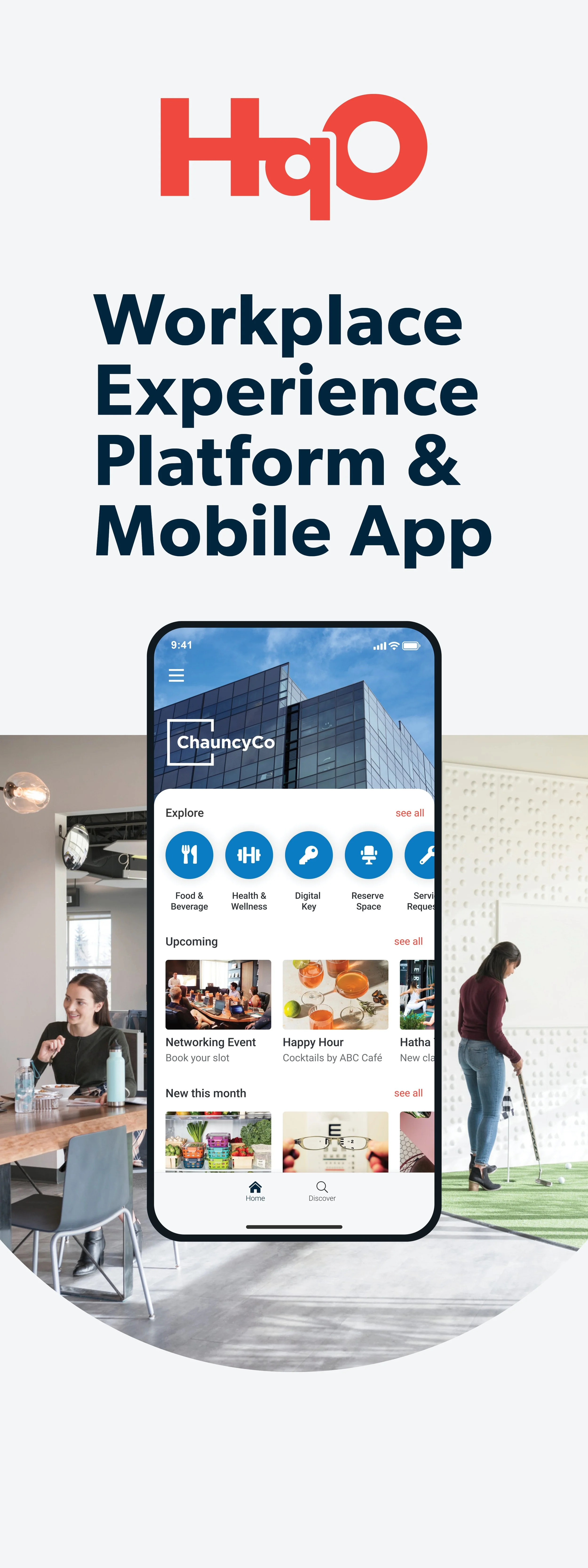
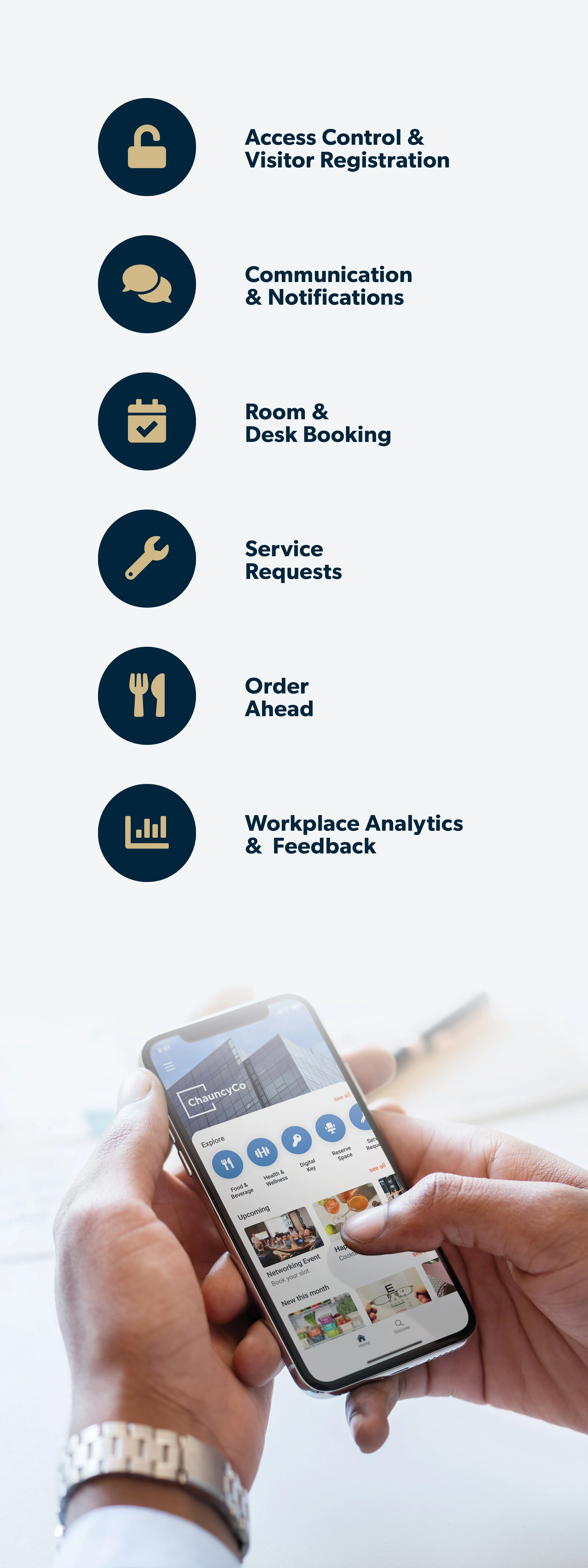
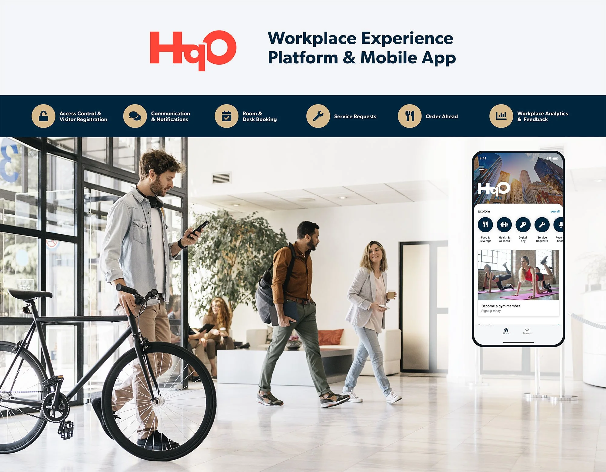
Built for employees and building owners, the Wx app puts building entry, lunch orders, transit checks and amenity booking in one place. I designed it to meet WCAG accessibility guidelines so it works for everyone in the building.
PRODUCT DESIGN

Events for landlords and tenants
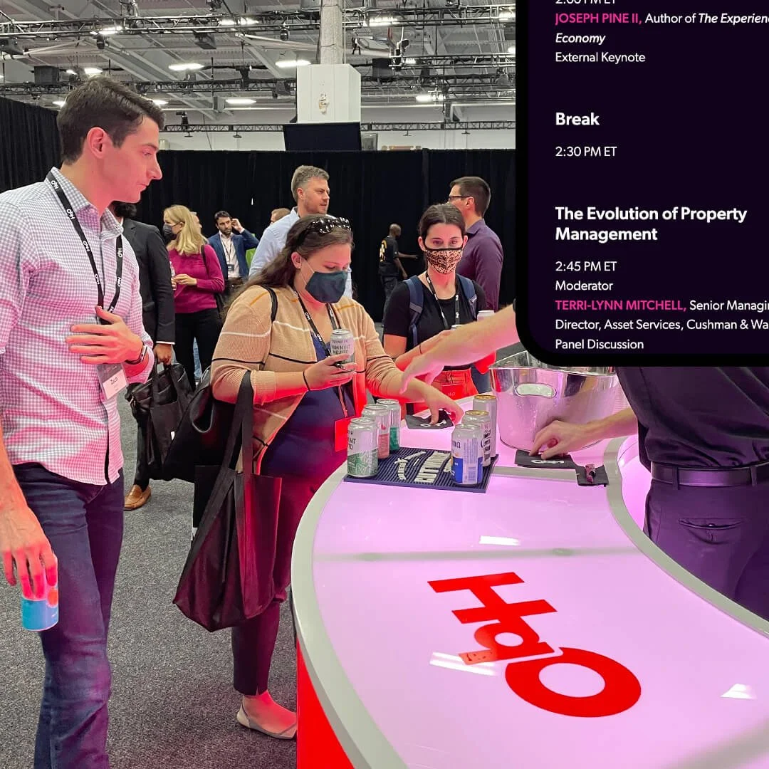
Events needed two voices: one for commercial tenants and one for landlords. From pull-up banners to a 115-inch stage backdrop, every piece had to say a lot in little space and stay readable for people of all abilities.
EVENT DESIGN

eBooks and ads
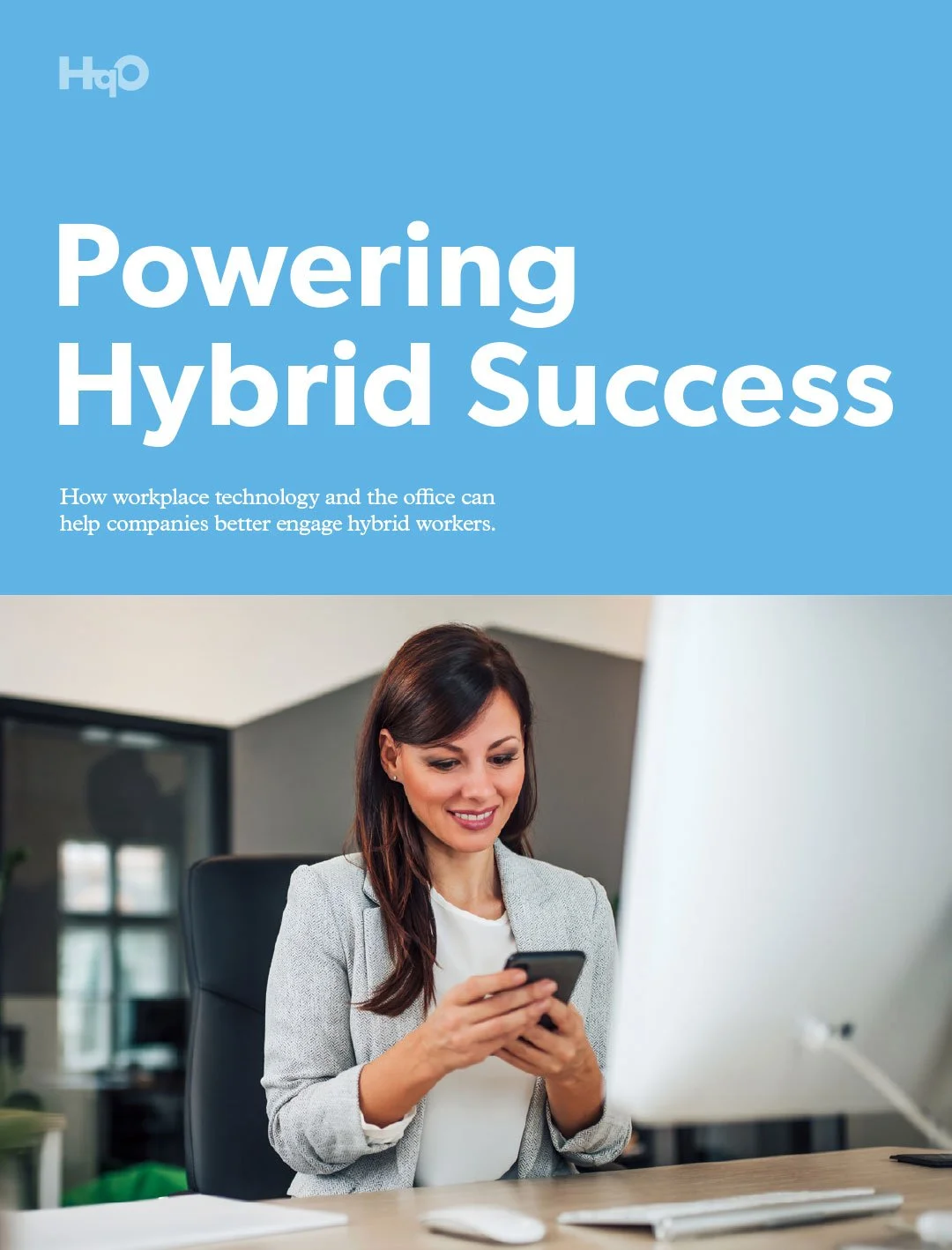
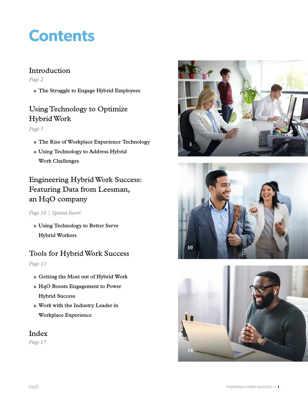
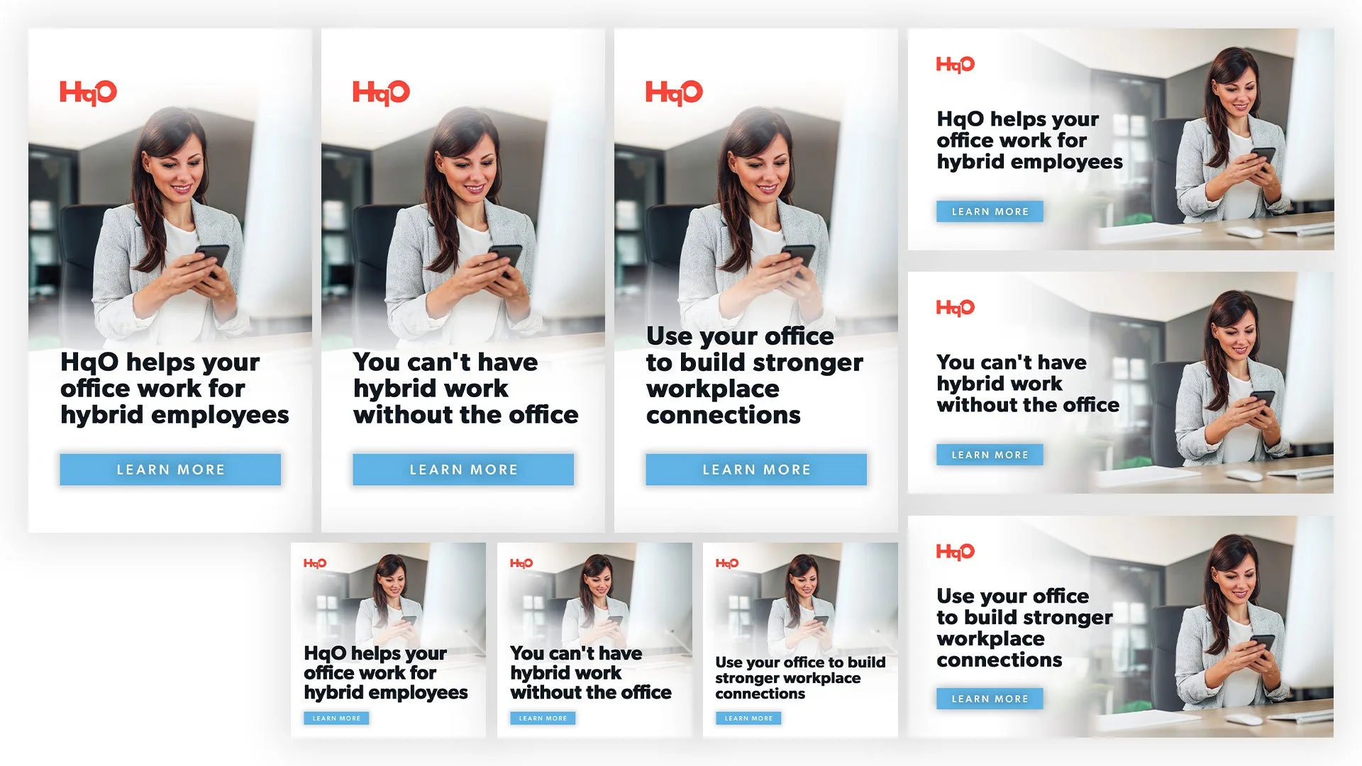
For HqO’s monthly eBooks, I turned supplied copy into designed stories with custom charts, graphs and product shots, then built the social graphics, display ads and web graphics that promoted each one.
CONTENT

At a glance
Rebrand · 2021
From sterile gray to HqO red
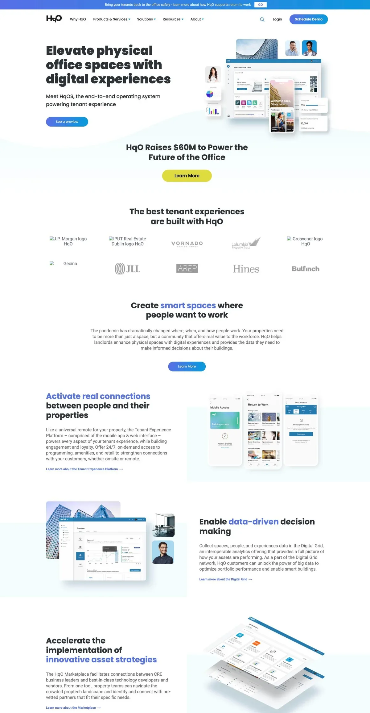
I joined HqO in 2021, when the brand was gray: a gray logo, and a website of gray type and light blue accents with a lot of empty space. For a company selling a better day at the office, it felt sterile.
One of my first projects was a modern refresh. I presented several bold directions, and the winner was a red logo with blue and bold type. Red was a deliberate break. The safe moves were refining the blue or reaching for a purple or green tint.
The mark itself changed only a little, on purpose. HqO already had signage and materials in buildings, so the new logo had to feel new without making any of it obsolete.

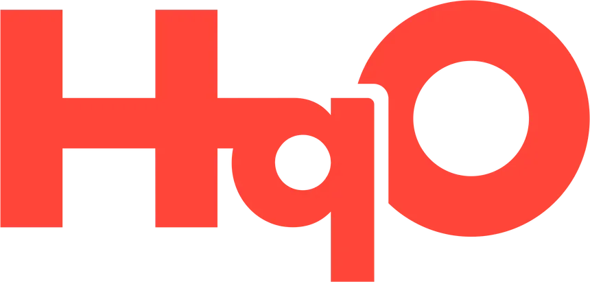
- A shorter qThe descender of the q comes up.
- A squared-off HThe rounded corners of the H are gone.
- Re-centered countersThe open “eyes” of the q and O move into place.
- More breathing roomThe break where the q meets the O opens up.
Product UI
Inside the Wx app
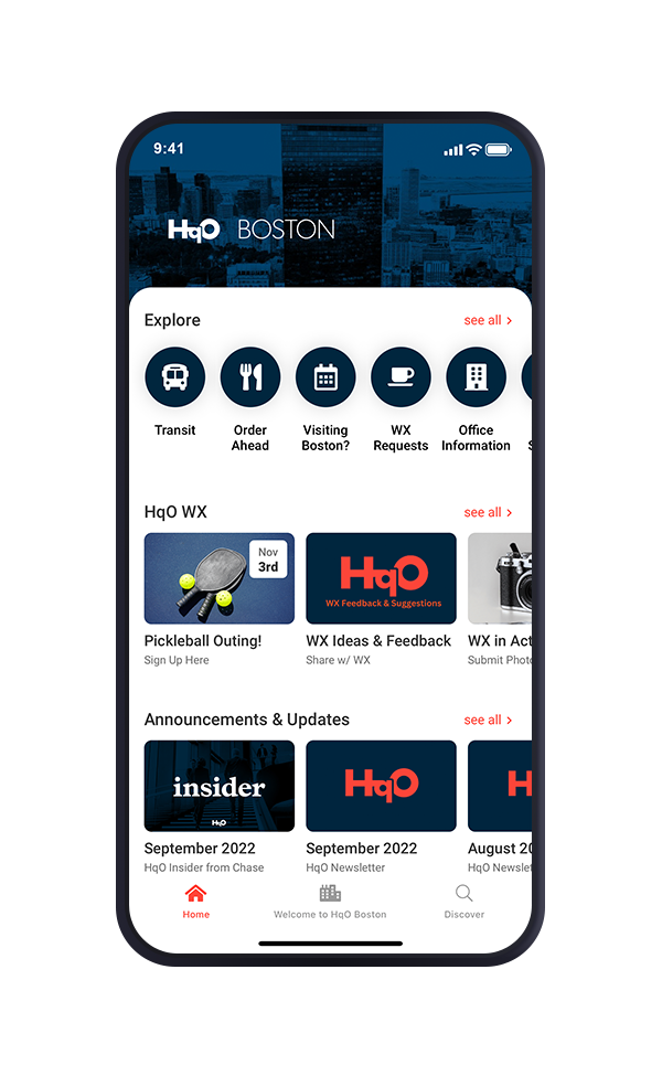
Built for employees and building owners, HqO’s Workplace Experience (Wx) app puts building entry, lunch orders, transit checks and amenity booking in one place. I designed it to meet WCAG accessibility guidelines so it works for everyone in the building.

One app, every building
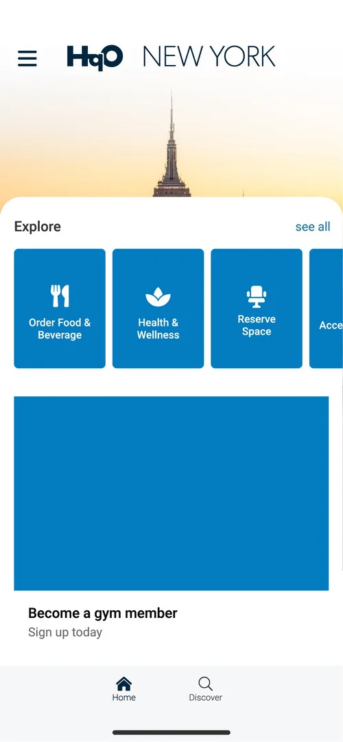
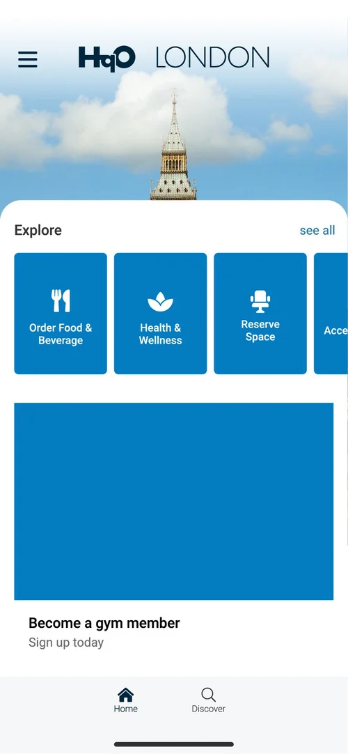
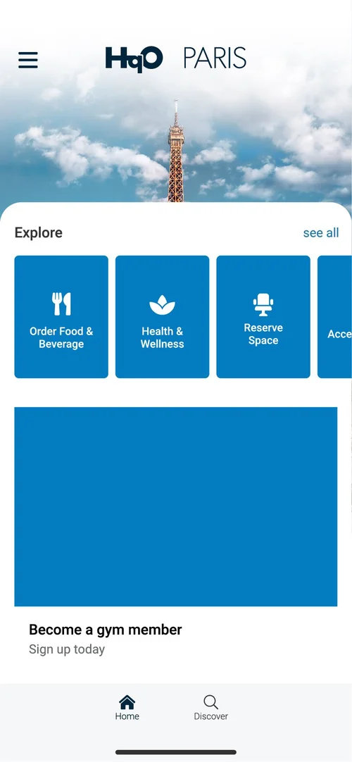
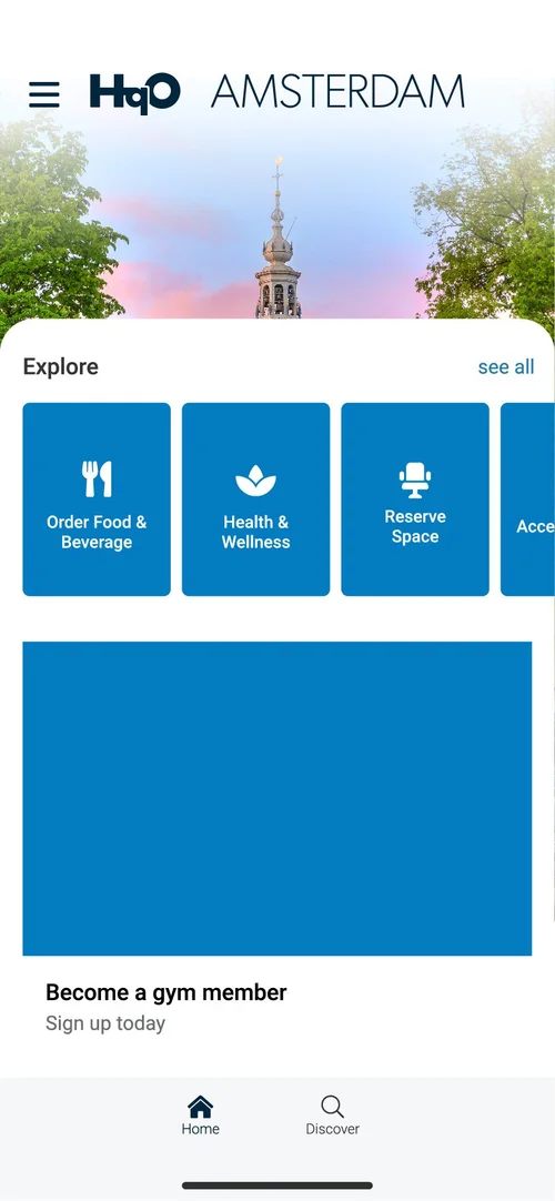
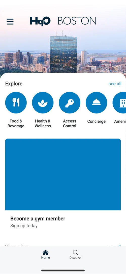
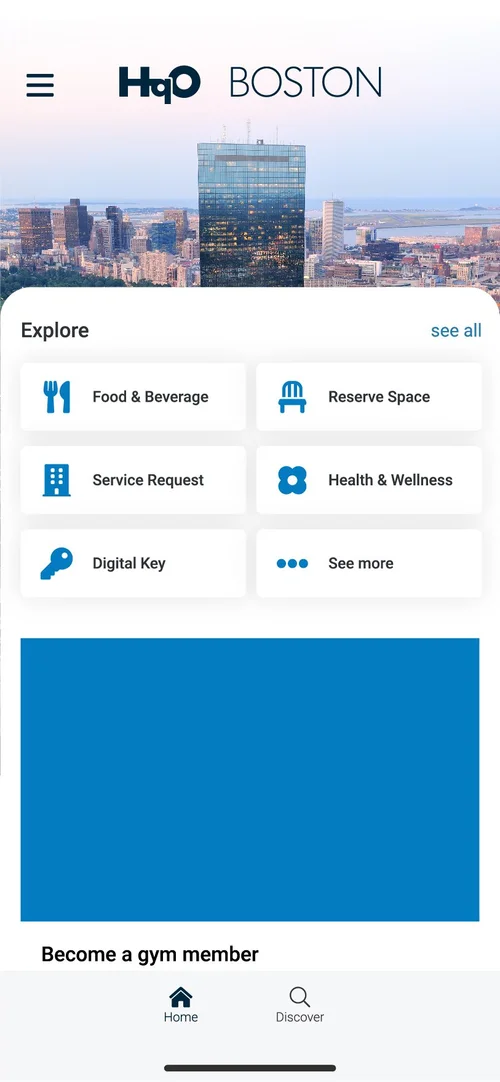
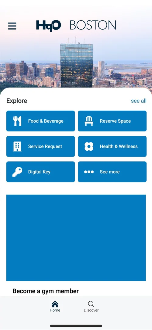
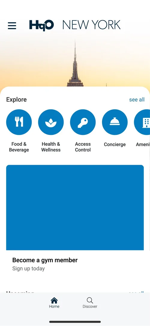
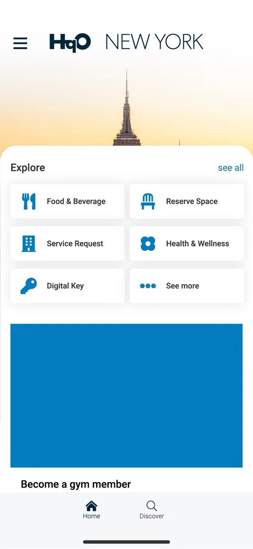
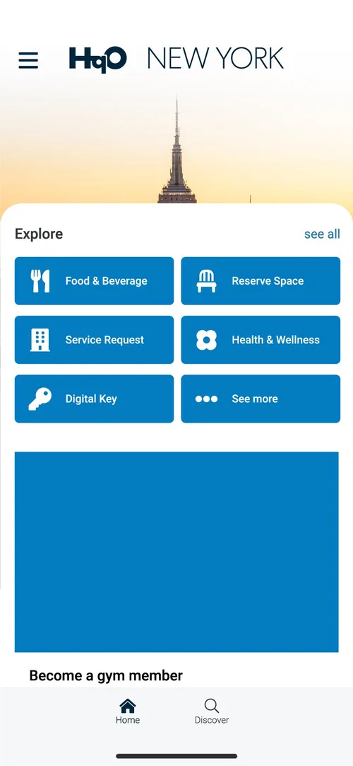
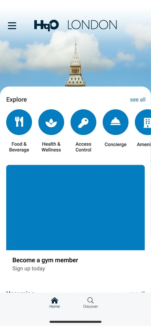
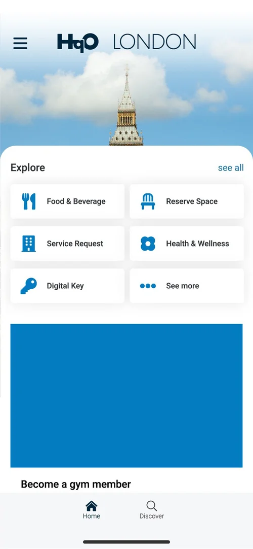
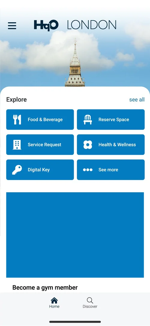
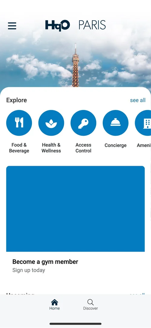
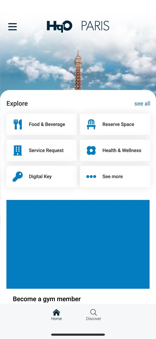
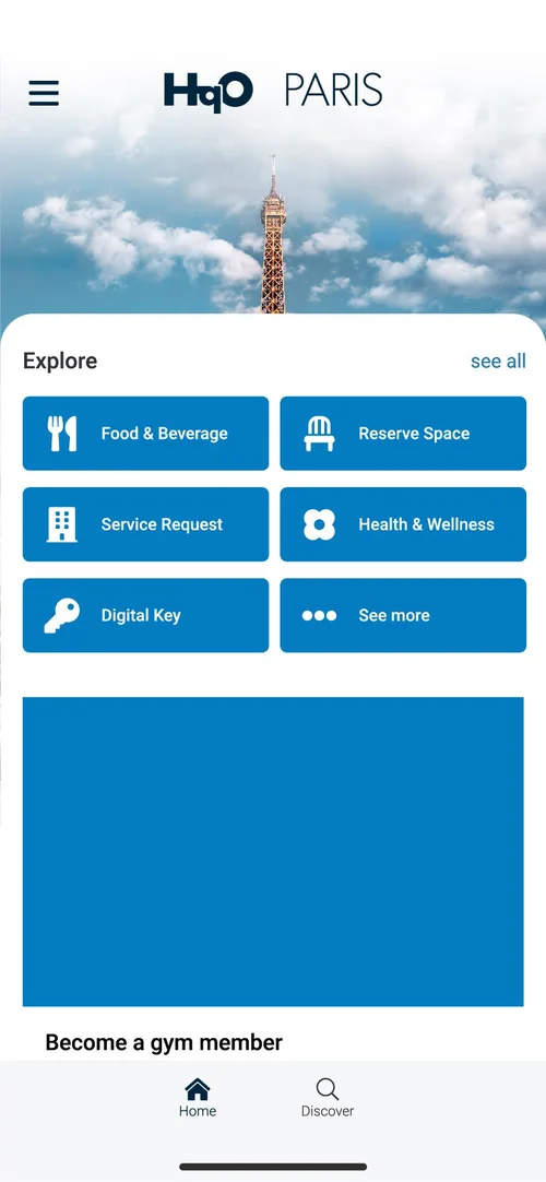
Wx is white-labeled for each property, so the home screen had to carry any building’s name and skyline and still read as HqO. I designed four tile styles for the Explore menu and set each one across five buildings, from Boston to Amsterdam. Pick a style to watch it ripple across all five.
- Boston
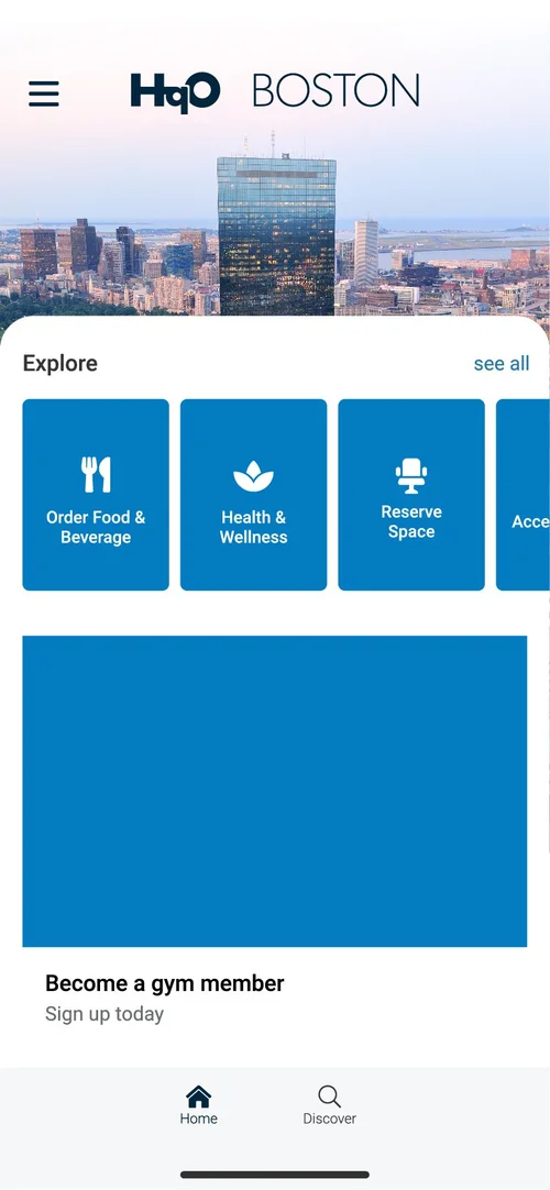
- New York
- London
- Paris
- Amsterdam
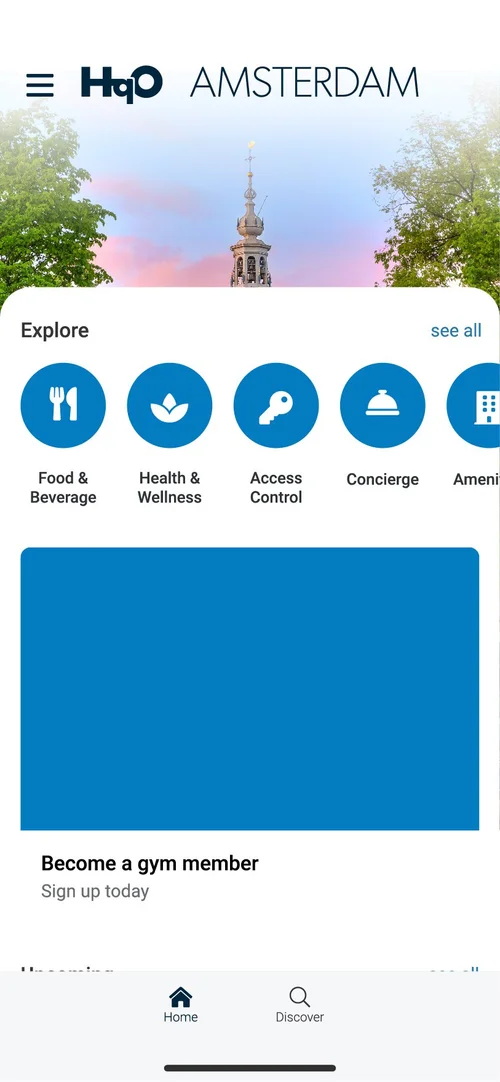
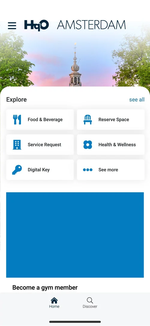
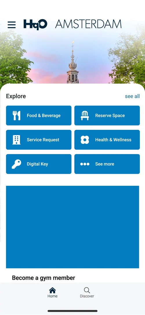


Events
Experience ’21 and ’22
Experience is HqO’s yearly event for landlords and tenants, and I designed its whole identity in 2021 and again in 2022. That started with the event mark and carried through the website, from the agenda and speaker pages to registration, and the recap graphics afterward. In 2022 the event moved to Tribeca 360 in New York, and I took the identity onto mobile and social for the invite.
Event site, 2021 hover to scroll


Events
Banners and a stage backdrop
HqO’s events needed two voices: one for commercial tenants and one for landlords. Two 3-by-8-foot pull-up banners for corporate events and a 115-inch backdrop for a landlord event each had to say a lot in little space and stay readable for people of all abilities.
Content
eBooks, guides and ads
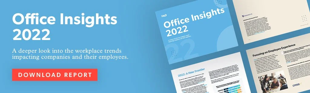
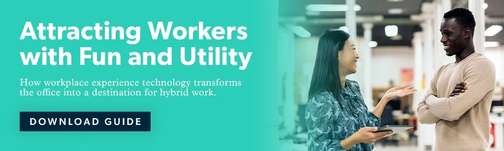
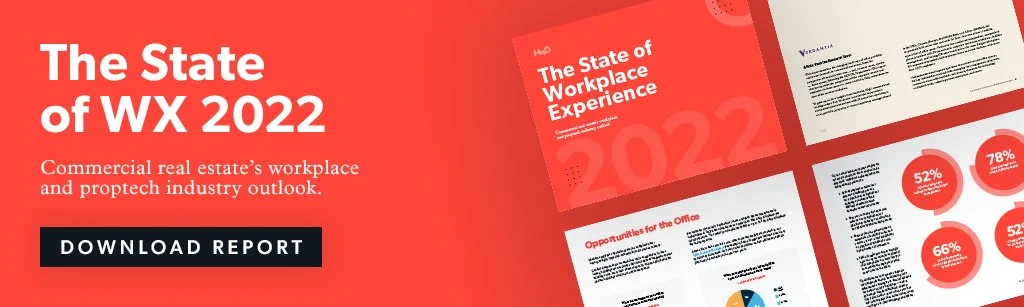
For HqO’s monthly eBooks and guides, including Powering Hybrid Success, I turned supplied copy into designed stories with custom charts, graphs and product shots. Then I built the social graphics, display ads and web graphics that promoted each one, plus a four-page landlord sales piece.

Writing
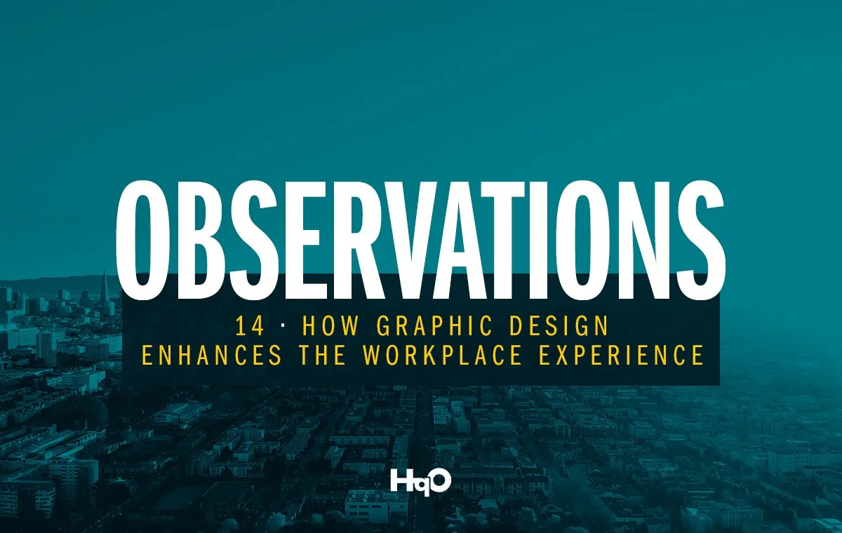
Observations: how graphic design enhances the workplace experience
I wrote this piece for HqO’s Observations blog about why the best workplace design goes unnoticed.
Good design is meant to be seamless. When it succeeds, it becomes invisible to employees by integrating itself into the fabric of daily life.Read the article on hqo.com (opens in a new tab)
Outcome
Feedback
“Ryan has an eye for design and has created stunning visuals for HqO, including a significant part of our company rebrand, the HqO website, and our company graphics and visual standards.” (Kristin Concannon, HqO)
Lessons
Building accessibility in from the start made the brand stronger, not more limited. The same rules that kept the app usable kept the event graphics and eBooks readable.

Legrand: branding the spaces where people live and work
NEXT CASE STUDY