
Regarding Wayfinding
Public symbol sets get drawn once and then patched for decades. The standard US set dates to the 1970s, long before anyone needed a sign for WiFi or a phone charger, so new symbols get added one at a time in whatever style is handy. My master's capstone asked what a set looks like when it is drawn to grow.

The problem
Symbol sets age faster than the signs that carry them
The 50 symbols AIGA drew for the US Department of Transportation in the 1970s still hang in airports and stations. They were drawn for the travel of their day. Since then we have added WiFi, mobile phones, new ways to get around and a far better understanding of who a sign has to serve.
Each new need gets its own symbol, usually from a different designer with different rules. Over time the set stops reading as one family, and the newest symbols are often the hardest to recognize.
“To become completely lost is perhaps a rather rare experience for most people in the modern city.”
Kevin Lynch, The Image of the City, 1960
Research
Seventy-five years of wayfinding on one sheet
Before drawing anything I mapped how wayfinding got here. The poster plots 75 years of projects, publications, Olympic Games and typefaces on a single transit-style line, color coded by type.

Legend
Mexico City, 1968
The case study at the center of the thesis was the 1968 Mexico City Olympics. Its pictograms for each sport and venue worked without a word of Spanish, and they set the bar for symbols that anyone can read. I later wrote about the Games for HqO as a landmark in accessible design.
Influences
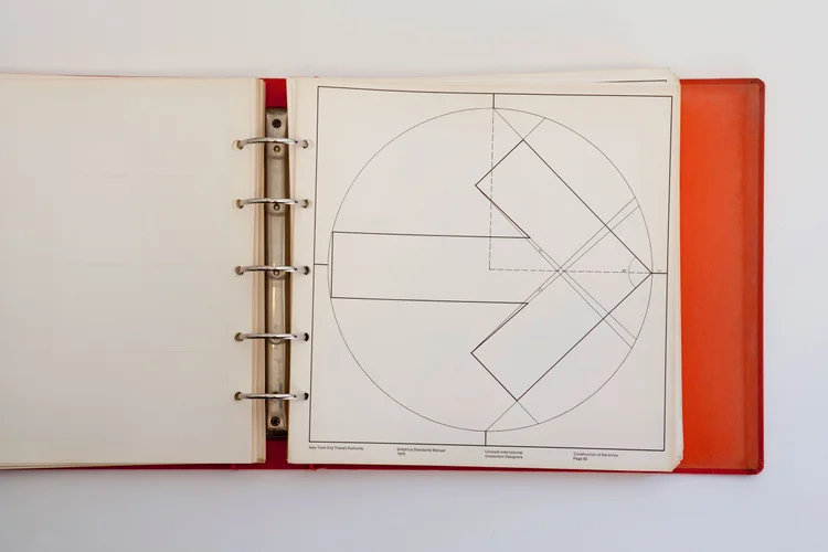
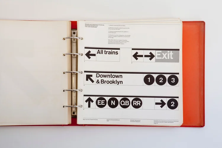
The film Helvetica sent me to Massimo Vignelli and Michael Bierut. Vignelli's 1970 Graphics Standards Manual for the New York City Transit Authority showed me what a system looks like when every sign follows the same rules, down to the grid under each arrow.

The fix
One grid and one stroke for every symbol
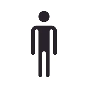
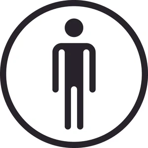
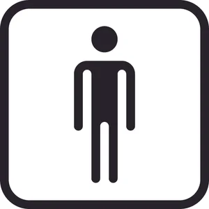
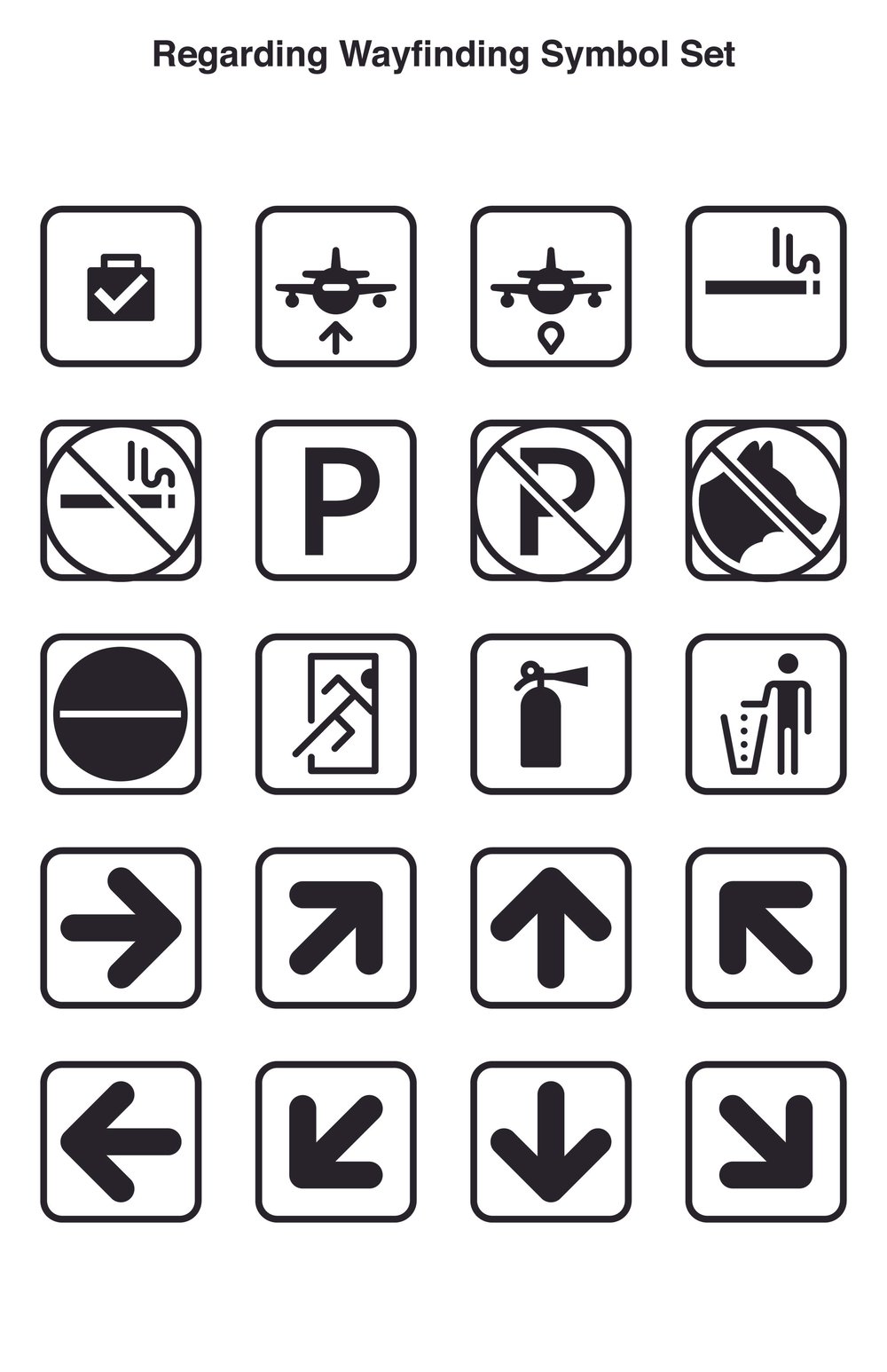
Every symbol in the set sits on the same square grid with a single stroke weight. Someone adding a symbol years later starts from the same rules, so the new one matches without guesswork. In the Person, the arms and legs are one grid module wide, and so is every gap between them.
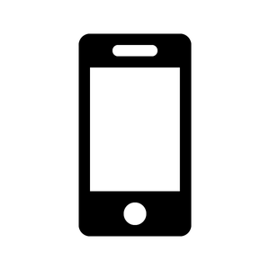
Where an old symbol no longer looked like the thing it stood for, I redrew it so any age group could read it. The corded handset became a smartphone. The set was a student project and it isn't perfect, but it shows what changes when a set is built to be extended.
Rules for the next symbol
- Draw on the 24 by 24 module grid.
- Use one stroke, one module wide, with rounded ends.
- Keep every gap between parts at one module.
- Size the figure to sit inside any holder without changes.
Same figure, any size
- 120 px
- 60 px
- 30 px
- 18 px
Same figure, any holder


The set
A family that can take the next symbol
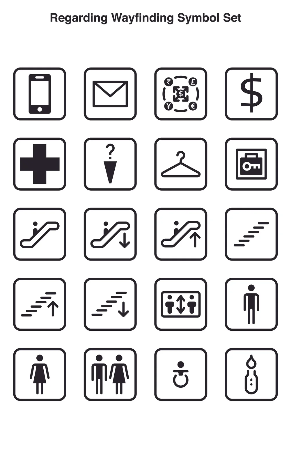
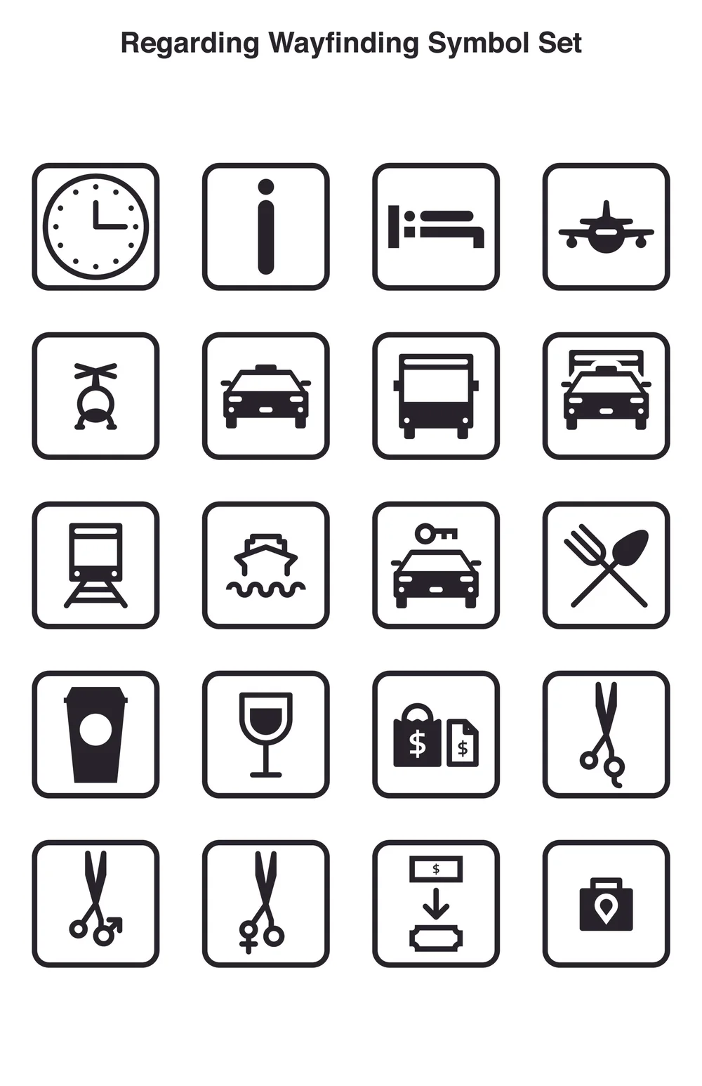
The finished set covers travel, services and safety, from arrivals and baggage claim to currency exchange and escalators. The short video below walks through the thesis, scored with CC0 music.
Read the full thesis, Regarding Wayfinding: Theory, Practice and Resolve (PDF).

Nasuni: giving file storage a brand people remember
NEXT CASE STUDY