Shebeen Brewing Company

Rich, Shebeen's owner, came to me when the brewery had one beer in cans and sold everything else by the growler. He wanted bottles that read as one family on a store shelf, and the label template we built together kept him coming back for the projects that followed.

Project
Freelance packaging
Scope
Bomber labels, can, tap handles
Client
Shebeen Brewing Company
Era
Early 2010s
Animated Irish Pale Ale can turning to show the full wrap
Irish Pale Ale can

The brief

A label built to take the next beer

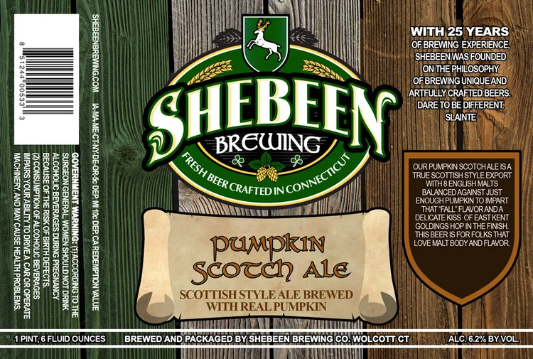
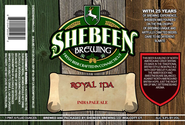
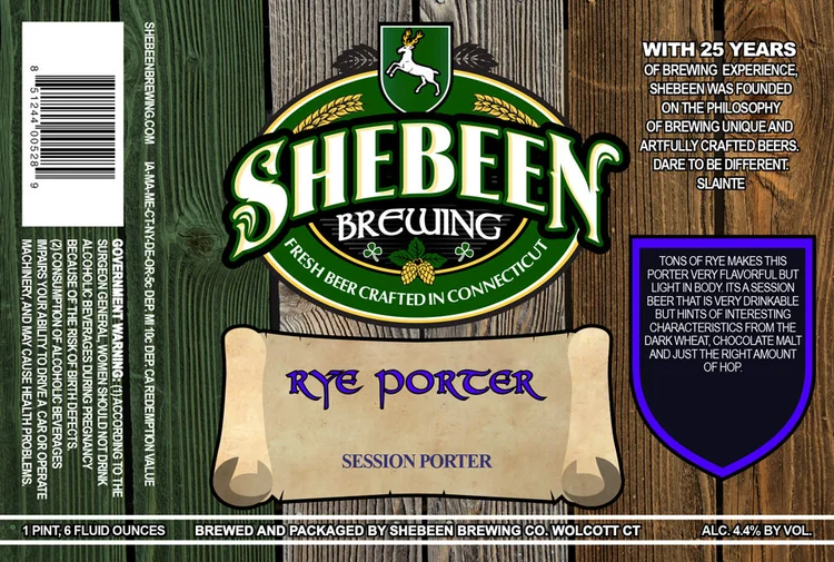
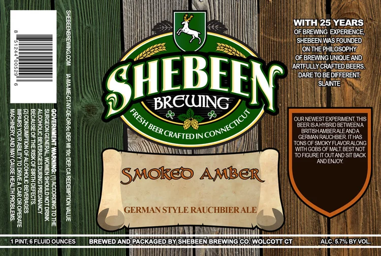
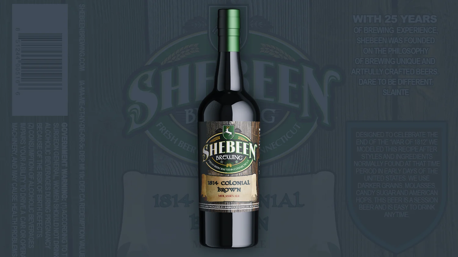
Shebeen was moving from growlers to 22 oz bomber bottles and released new styles often, so Rich needed a label a new beer could drop into without a redesign. The wood planks, the crest and the parchment scroll stay fixed. Each beer changes only its name, its tasting notes and the color of the shield on the right panel.
  • Label template
  • Bomber bottles
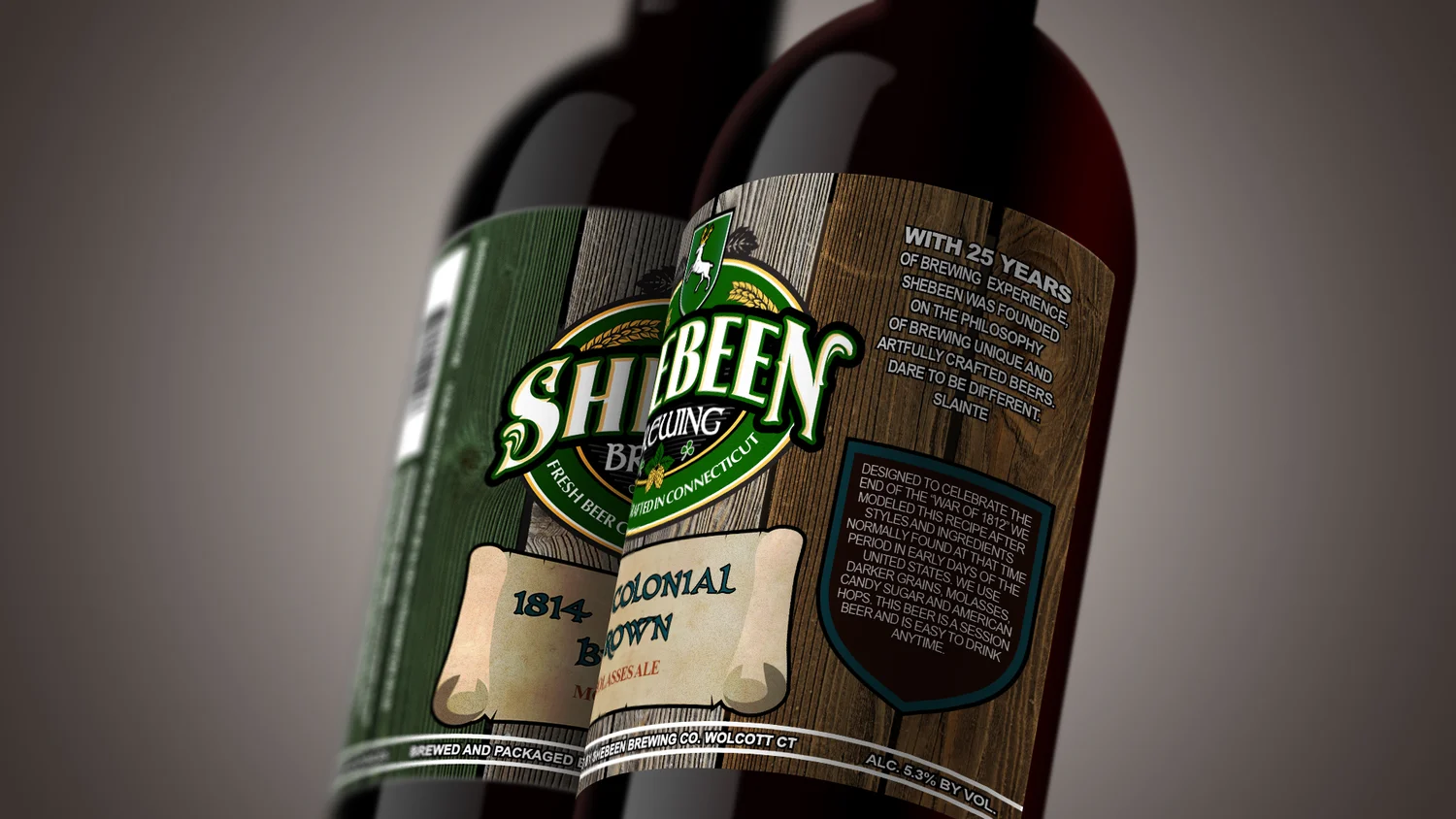
Two Shebeen bomber bottles side by side showing the crest, scroll and side panels of the 1814 Colonial Brown label
1814 Colonial Brown, front and side
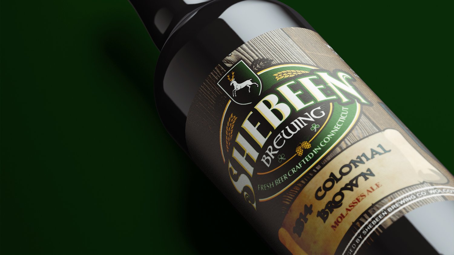
Close angled view of the Shebeen crest and scroll on a dark green background
The crest up close

The lineup, scroll to see all 16
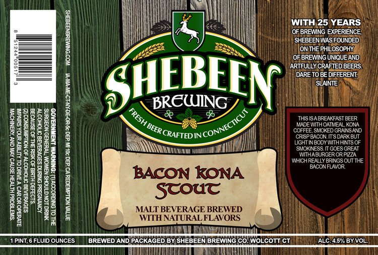
Bacon Kona Stout label
Bacon Kona Stout
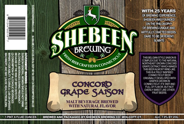
Concord Grape Saison label
Concord Grape Saison
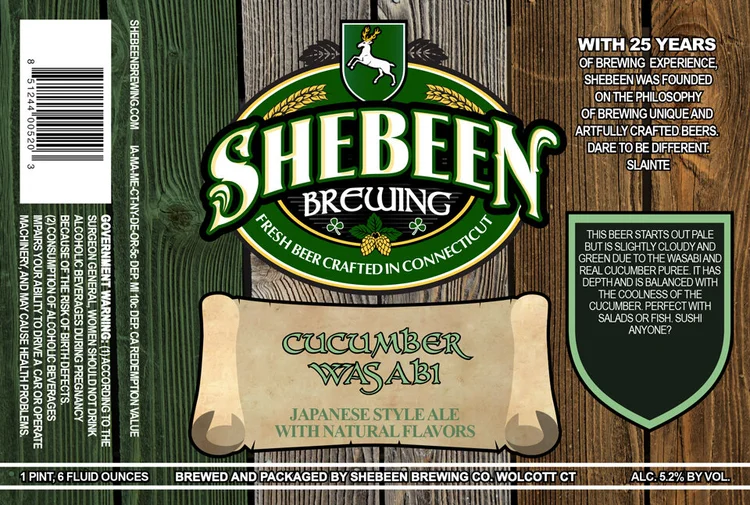
Cucumber Wasabi label
Cucumber Wasabi
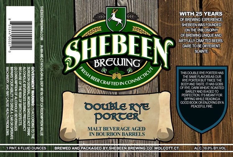
Double Rye Porter label
Double Rye Porter
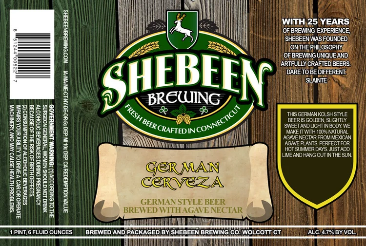
German Cerveza label
German Cerveza
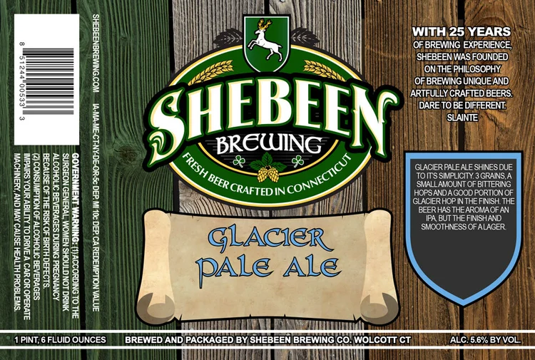
Glacier Pale Ale label
Glacier Pale Ale
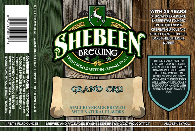
Grand Cru label
Grand Cru
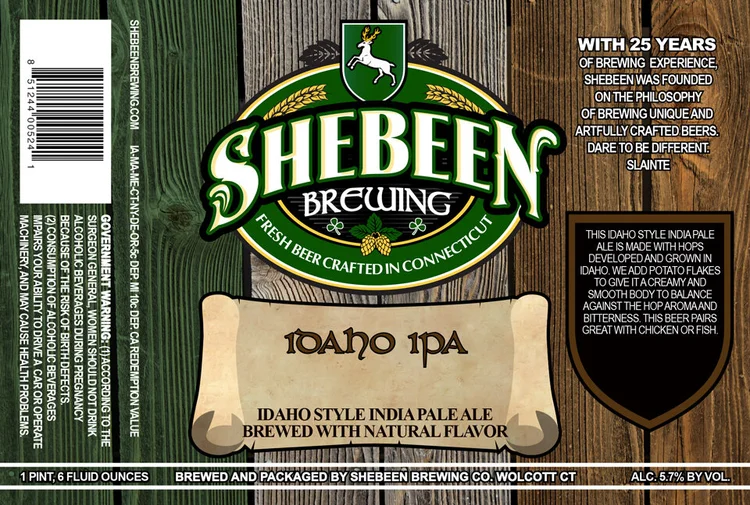
Idaho IPA label
Idaho IPA
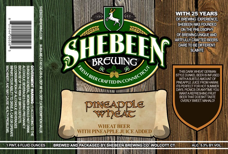
Pineapple Wheat label
Pineapple Wheat
Pumpkin Scotch Ale label
Pumpkin Scotch Ale
Royal IPA label
Royal IPA
Rye Porter label
Rye Porter
Smoked Amber label
Smoked Amber
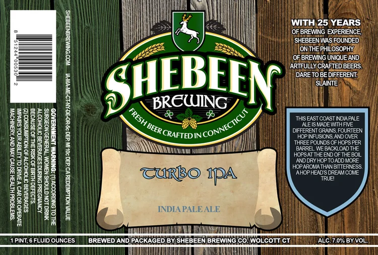
Turbo IPA label
Turbo IPA
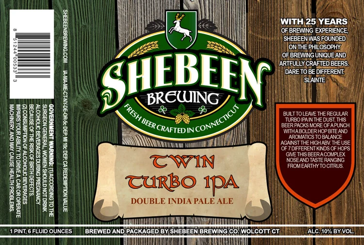
Twin Turbo IPA label
Twin Turbo IPA
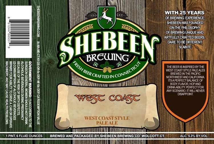
West Coast label
West Coast

The brief also covered a four-pack carrier and new tap handles in the same visual language.

On the shelf

Easy to find in a row of dark bottles

A store shelf is where a beer label earns its keep. The green neck foil and the pale scroll pick Shebeen out from the bottles around it, and two different beers in the same template already look like a brand.
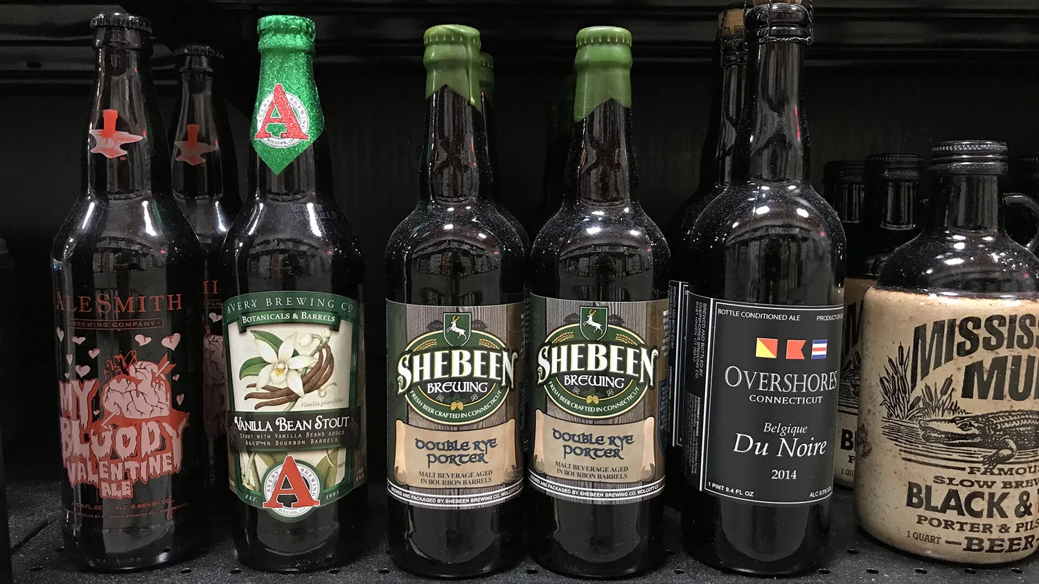
Store shelf with two Shebeen Double Rye Porter bombers between bottles from other breweries
Double Rye Porter on a store shelf
Shebeen bomber bottle in front of its full flat label
Bottle in front of the full label

Irish Pale Ale

Making a young brewery's mark look old

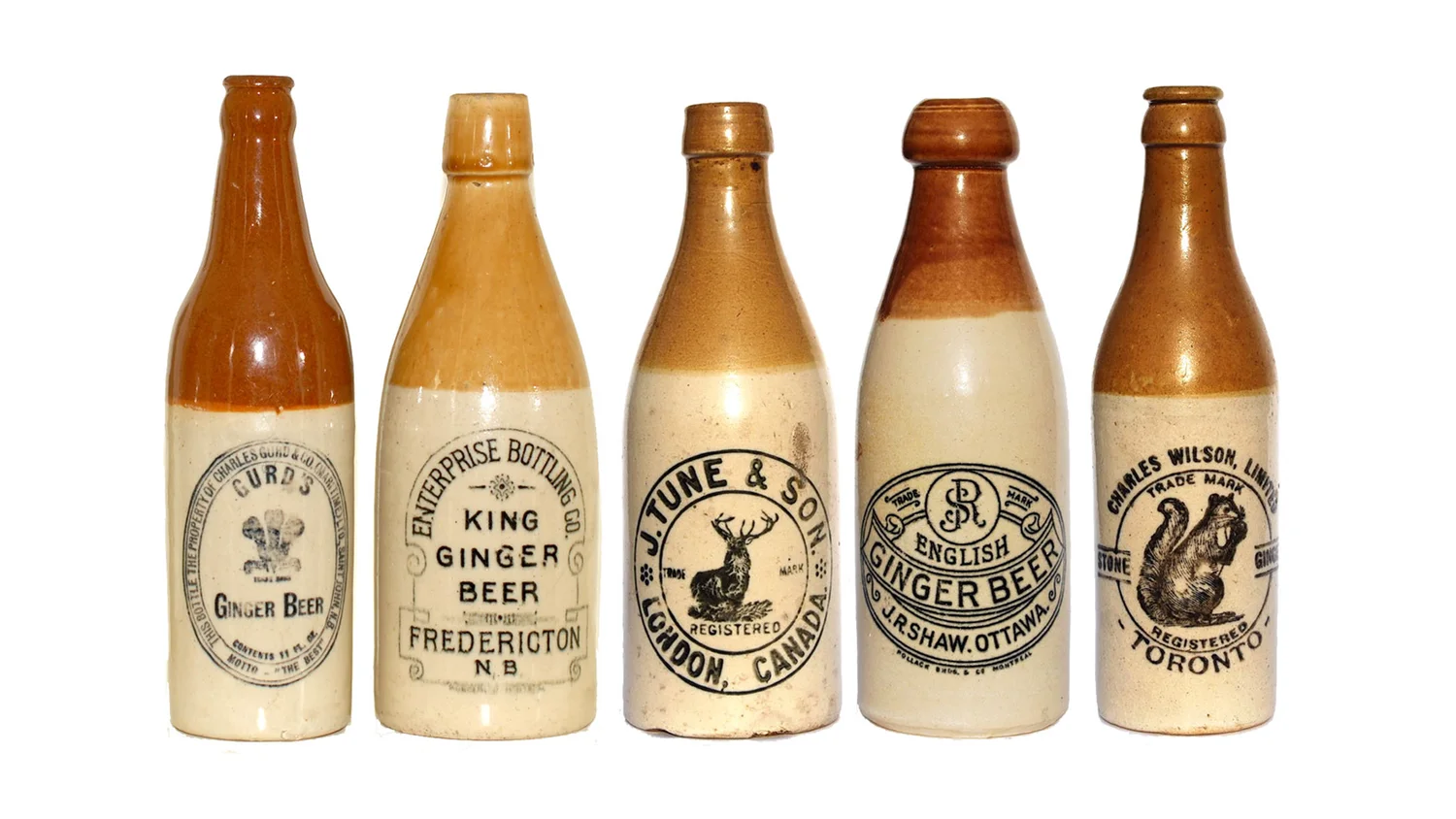
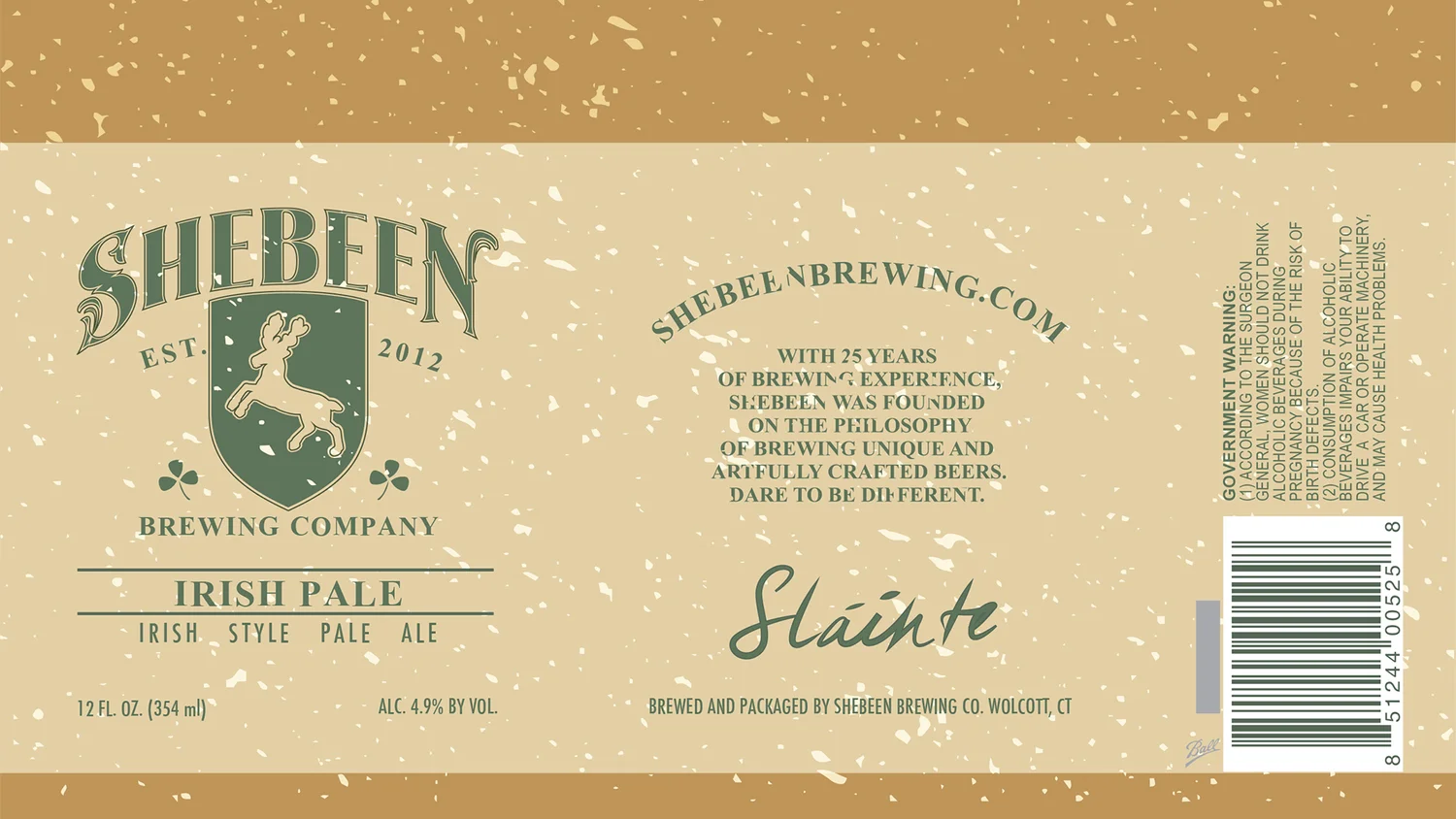
For the Irish Pale Ale can, the goal was to age the logo up. I looked at old stoneware ginger beer bottles and their stamped oval seals, then rebuilt the mark as a single-color crest with EST. 2012 tucked beside the shield. Warm, printed-looking inks on a speckled ground finish the effect.
  • Can
  • Logo refresh
Five antique stoneware ginger beer bottles with stamped oval seals
Inspiration: stoneware bottles
Flat Irish Pale Ale can wrap with the green Shebeen crest on a speckled tan ground
The flat can wrap

Palette

  • Tan#D9C79E
    PMS 7501 C
  • Copper#B68150
    PMS 729 C
  • Warm grey#65665D
    PMS 417 C

The can

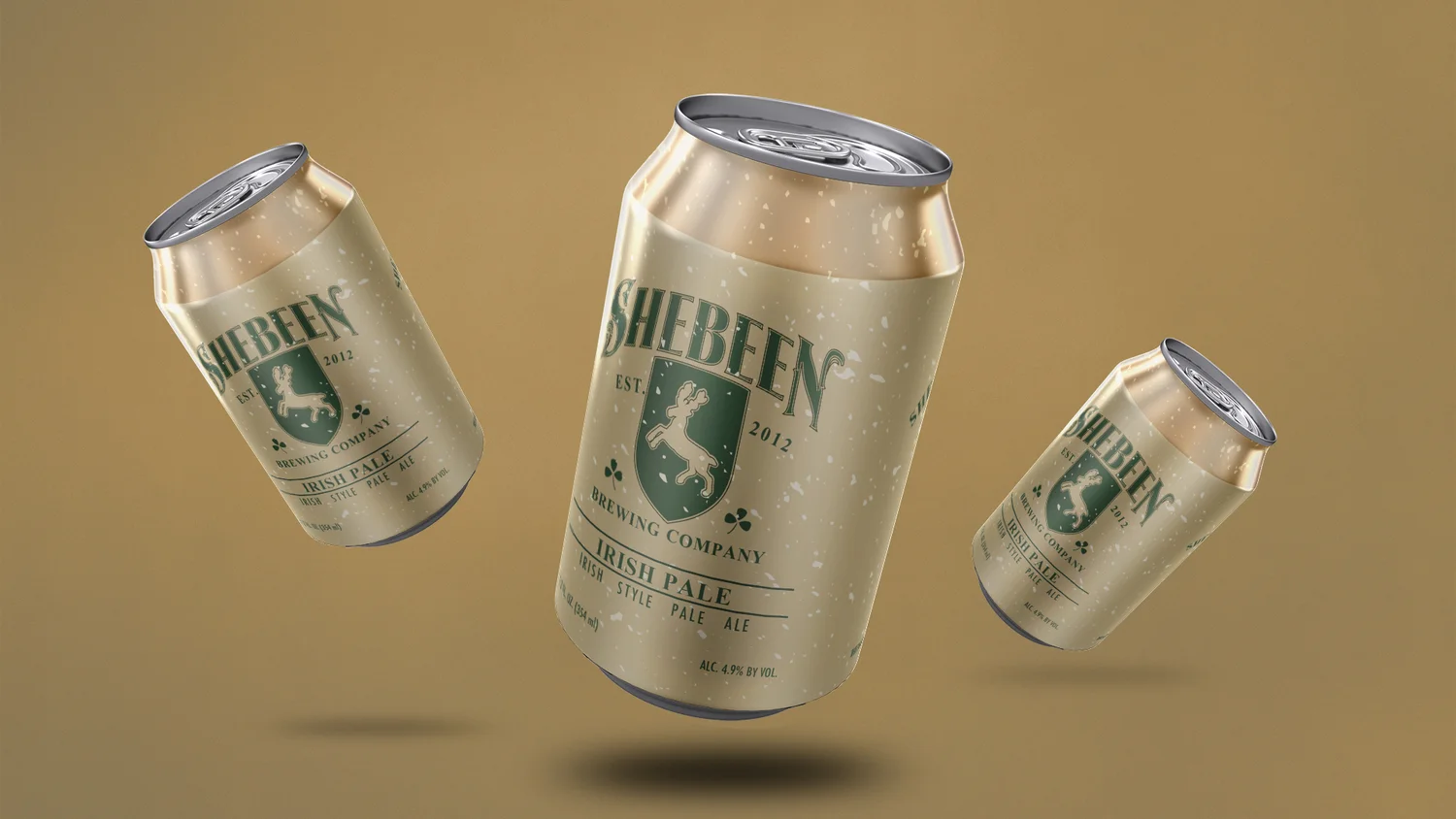
Three Irish Pale Ale cans floating over a tan background
Can render
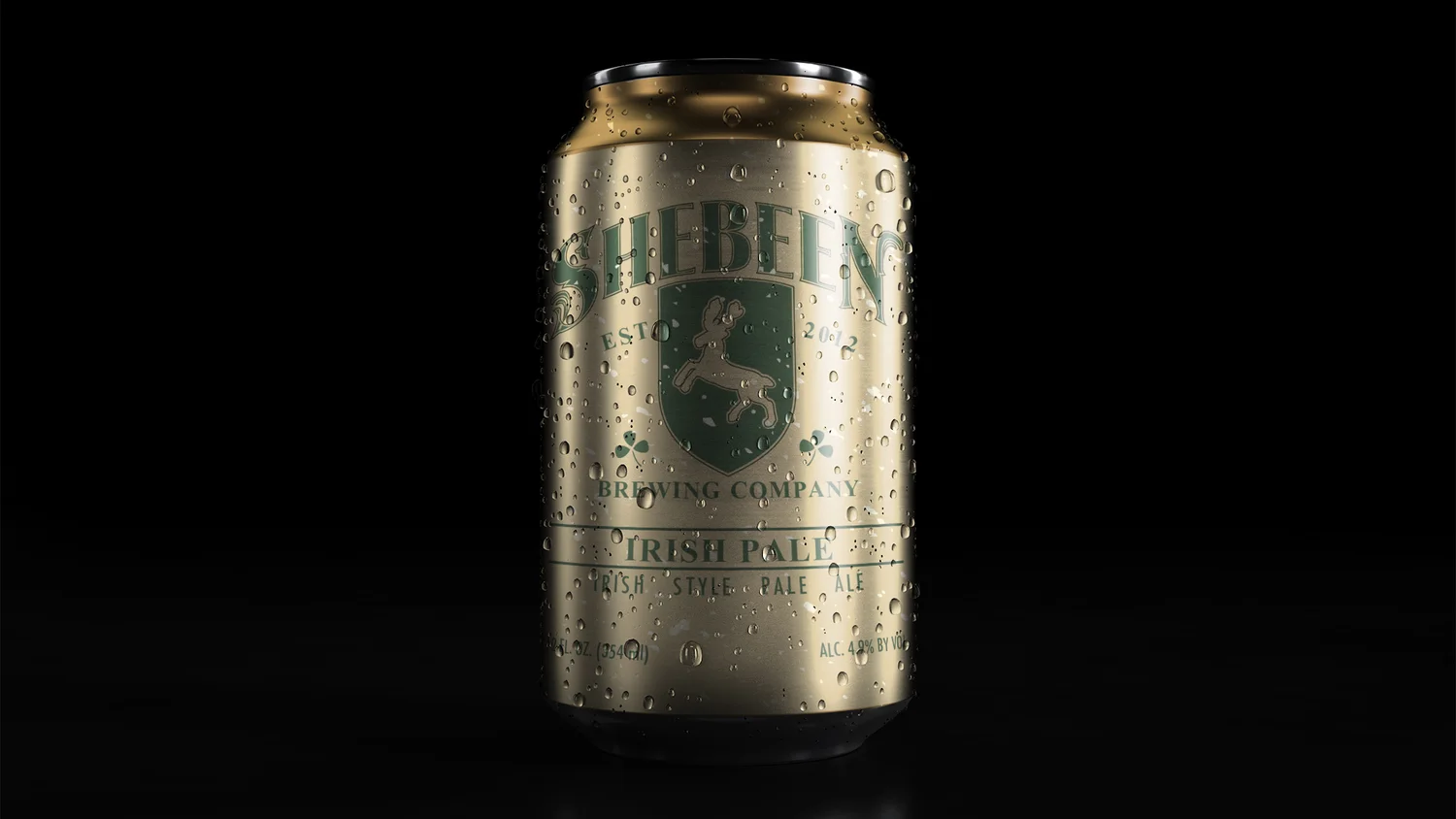
Single Irish Pale Ale can with condensation on a black background
Cold, on black

See the brewery today at shebeenbrewing.com.

Nasuni: giving file storage a brand people remember

NEXT CASE STUDY

Previous
Previous

Mattatuck Scout Reservation

Next
Next

Regarding Wayfinding